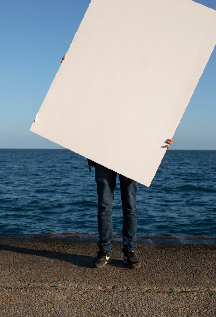
Goodlife
IS WEL-COME
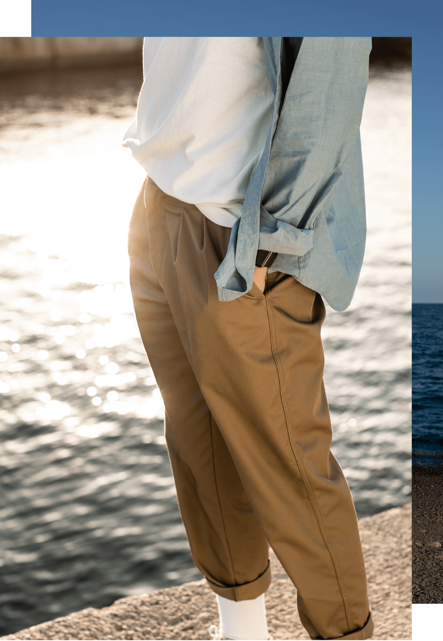
Client: BARNER
Photographer: IVAN CASTER
Stylist: OTTI RAMIREZ
Graphic Design / Art Direction: AMAIA F.GOROSTIZA
Amaia F. Gorostiza – Art Direction and Design
Art Direction Portfolio of Amaia Fernández de Gorostiza
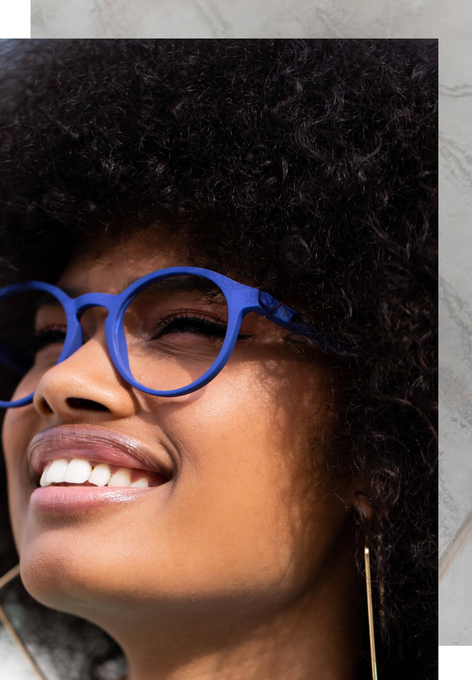
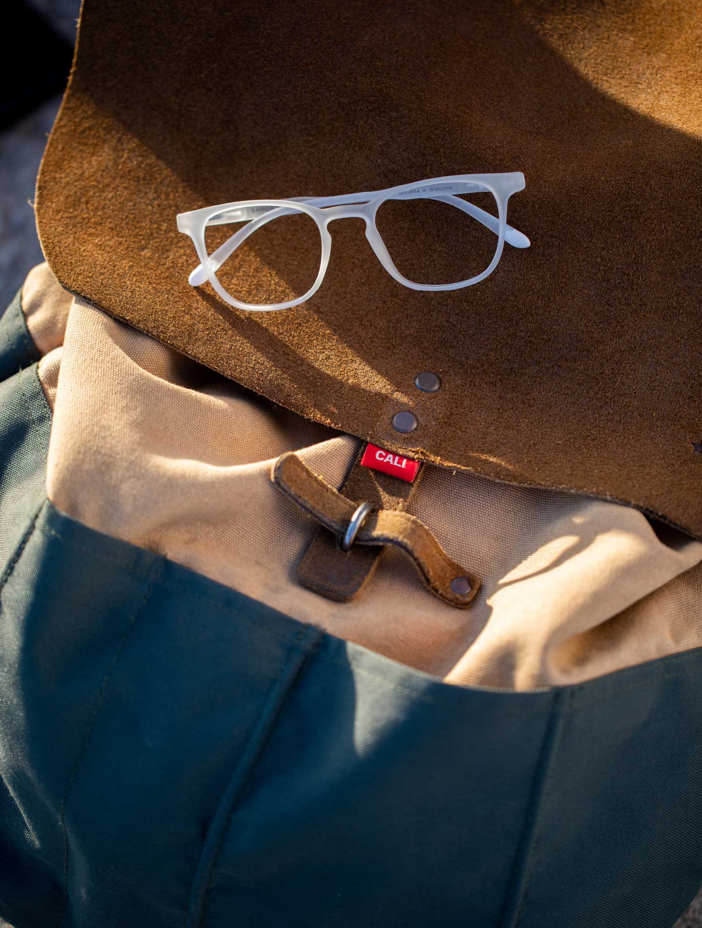
Client: BARNER
Photographer: IVAN CASTER
Stylist: OTTI RAMIREZ
Graphic Design / Art Direction: AMAIA F.GOROSTIZA
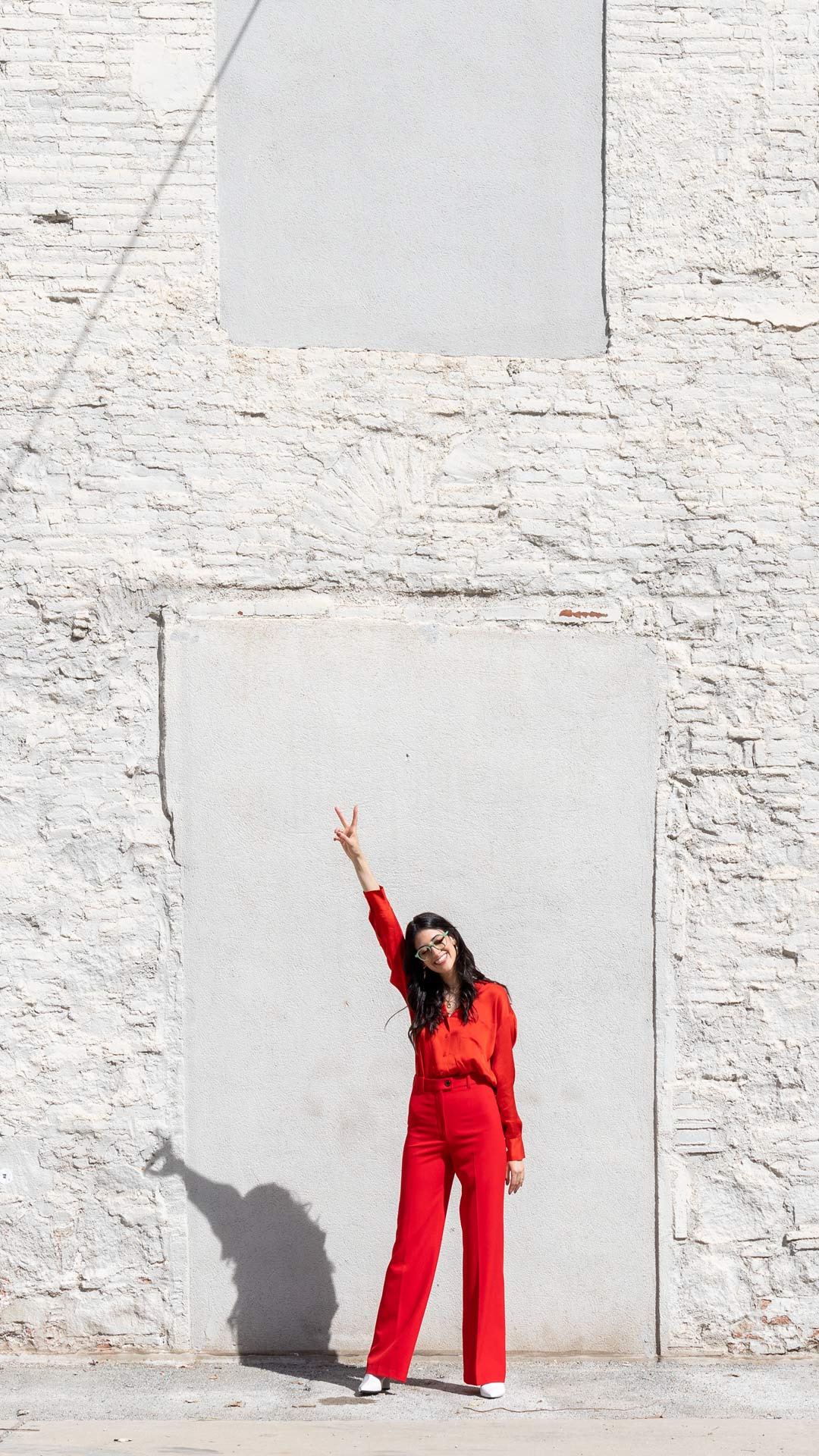
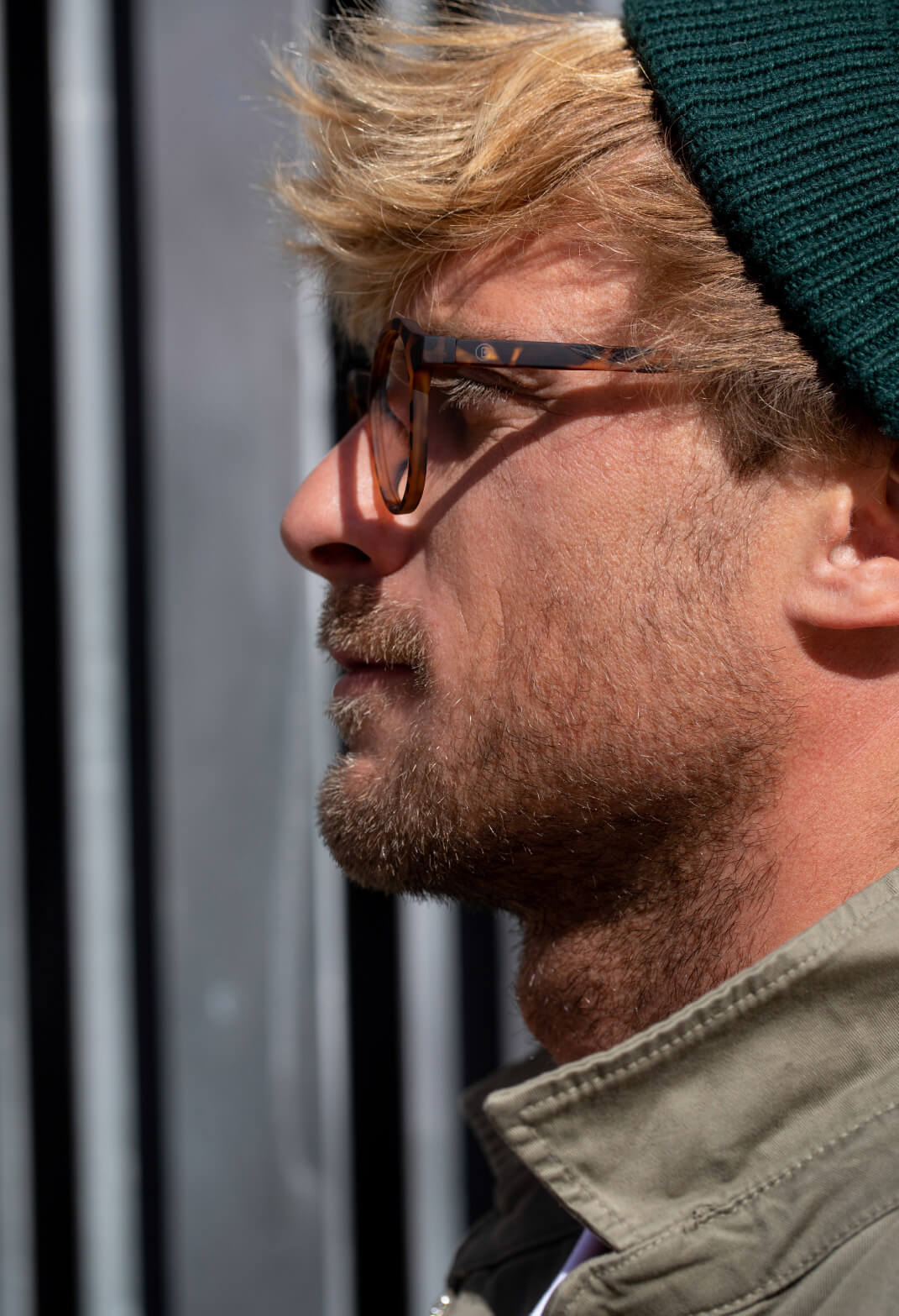
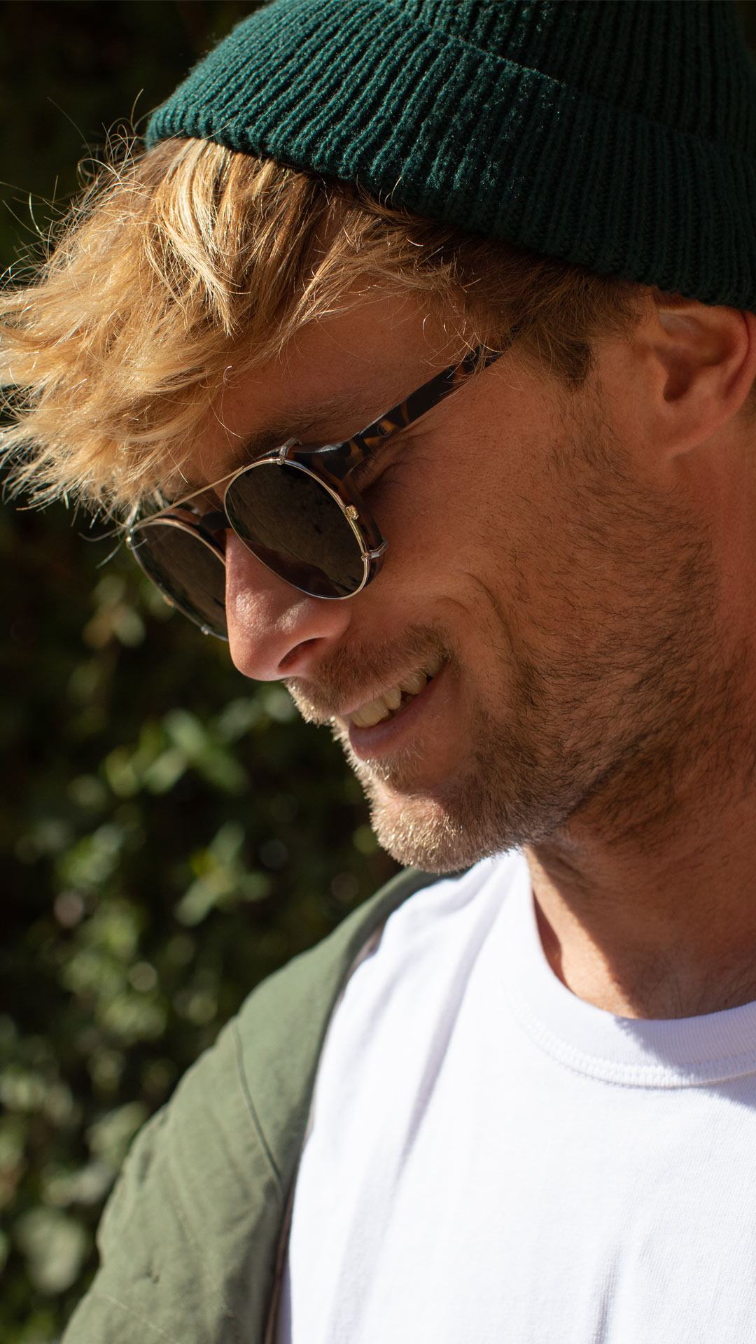
Client: BARNER
Model Photographer: IVAN CASTER
Stylist: OTTI RAMIREZ
Art Direction/Graphic Design:
AMAIA F.GOROSTIZA
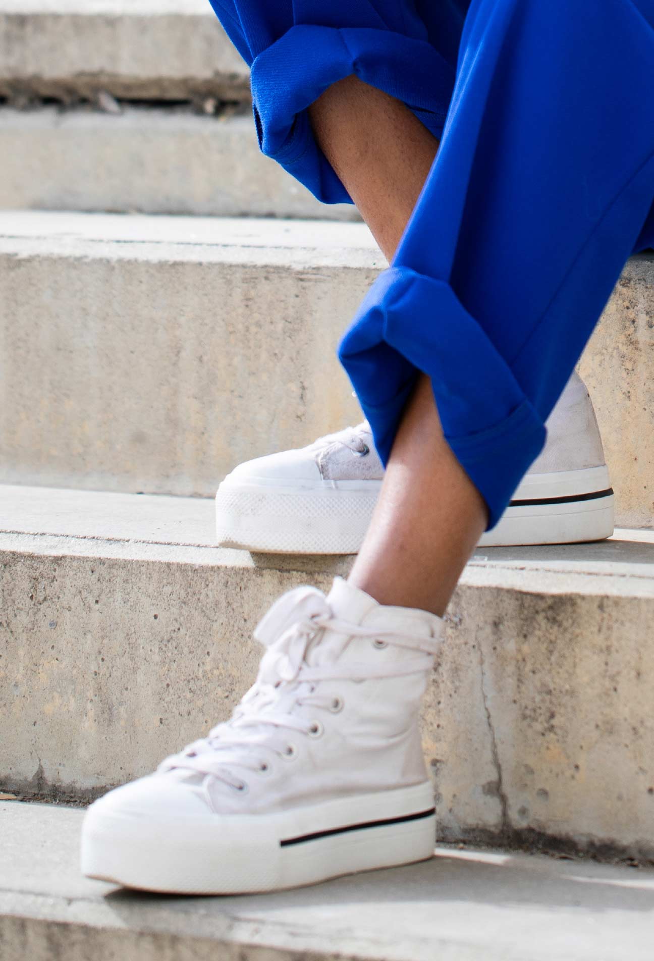
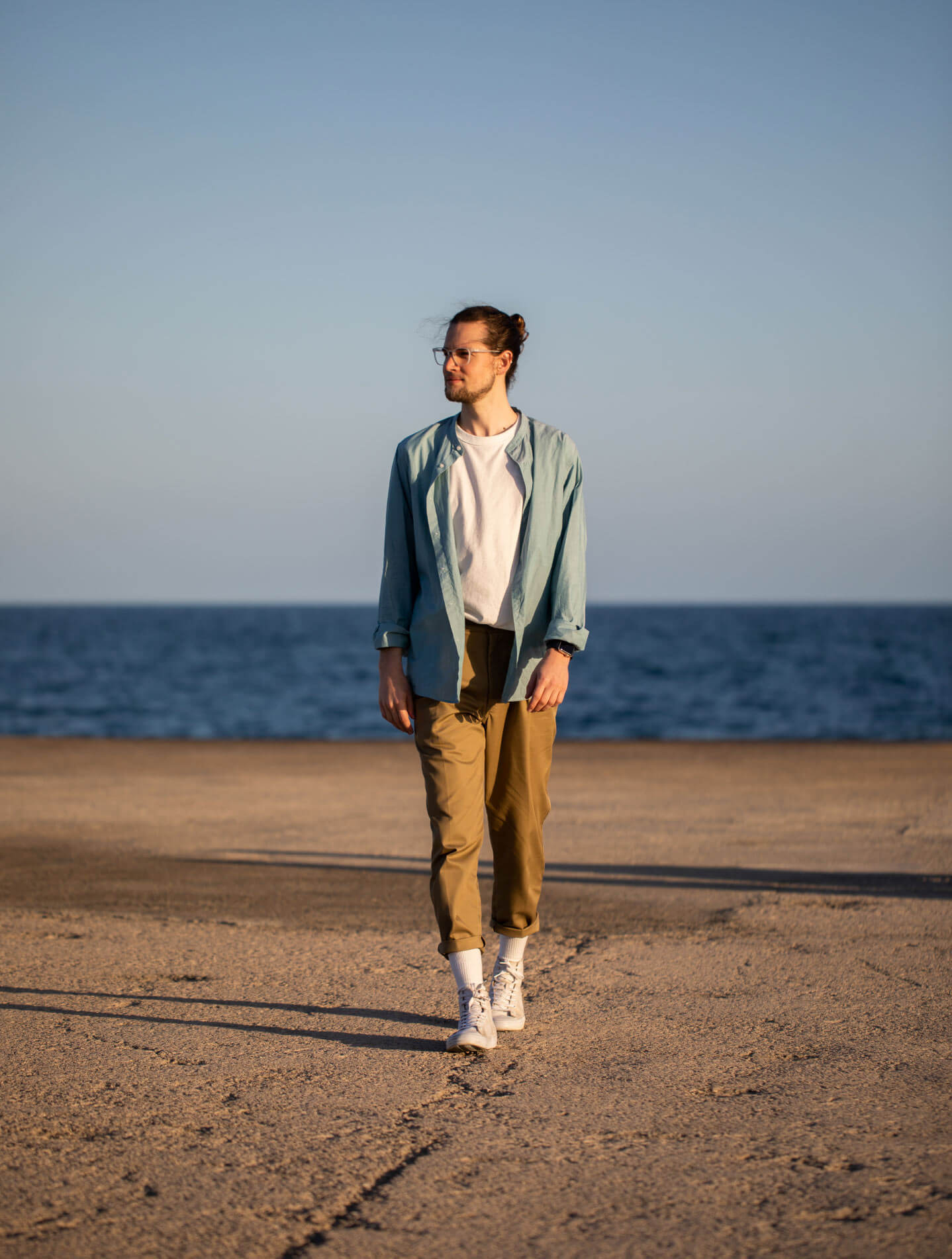
Client: BARNER
Model Photographer: IVAN CASTER
Stylist: OTTI RAMIREZ
Art Direction/Graphic Design:
AMAIA F.GOROSTIZA

After the success of its first Kickstarter campaign, the digital glasses brand Barner decided to define a new business strategy to improve its competitive advantage. Their initial approach needed to evolve to reach a larger potential market.
After the success of its first Kickstarter campaign, the digital glasses brand Barner decided to define a new business strategy to improve its competitive advantage. Their initial approach needed to evolve to reach a larger potential market. Their initial approach needed to evolve to reach a larger potential market.

After the success of its first Kickstarter campaign, the digital glasses brand Barner decided to define a new business strategy to improve its competitive advantage. Their initial approach needed to evolve to reach a larger potential market. Their initial approach needed to evolve to reach a larger potential market.
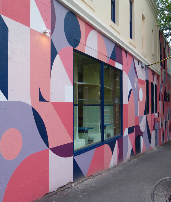
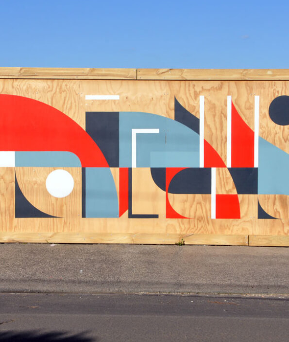
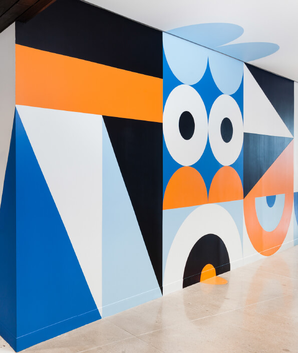
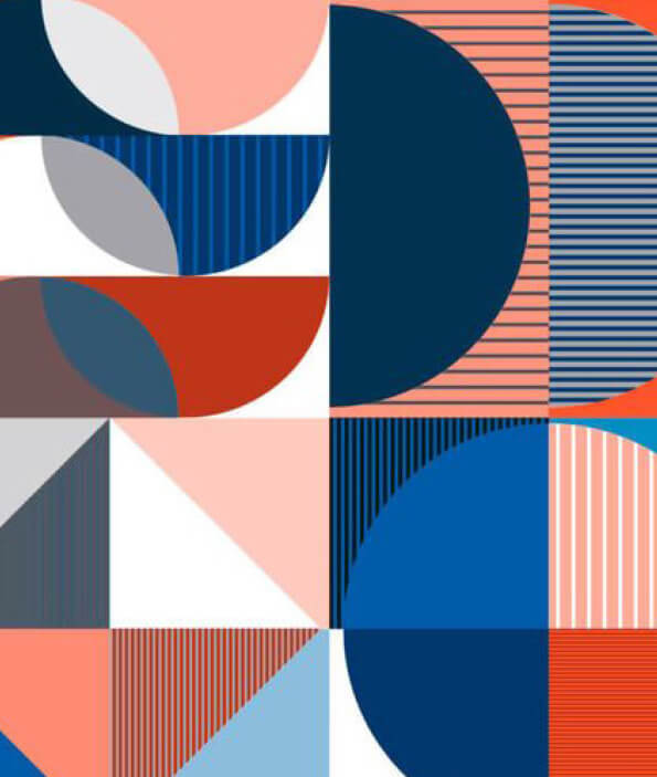
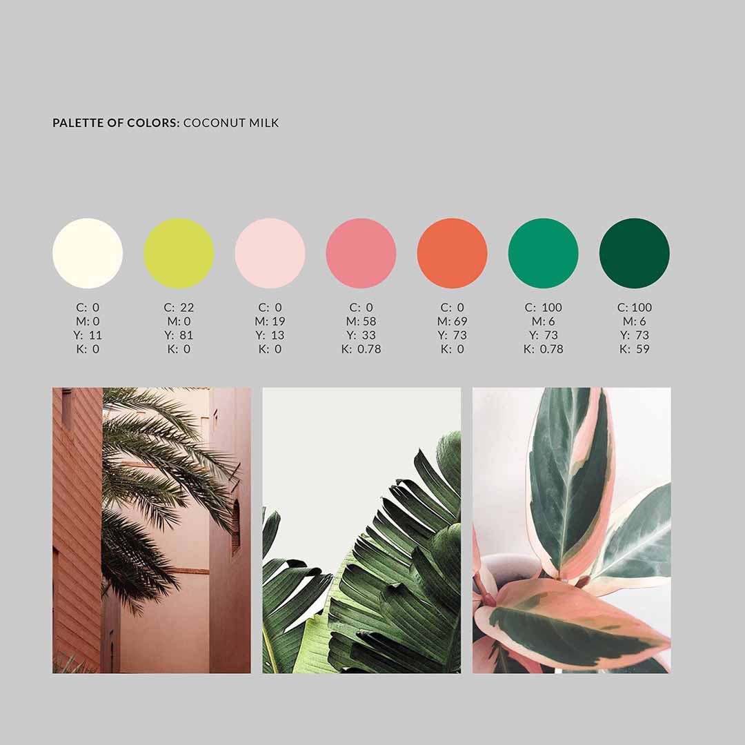
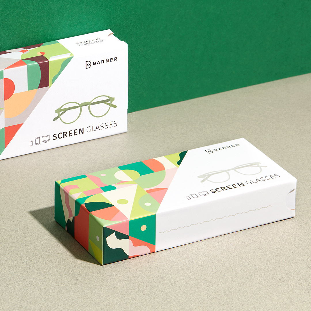
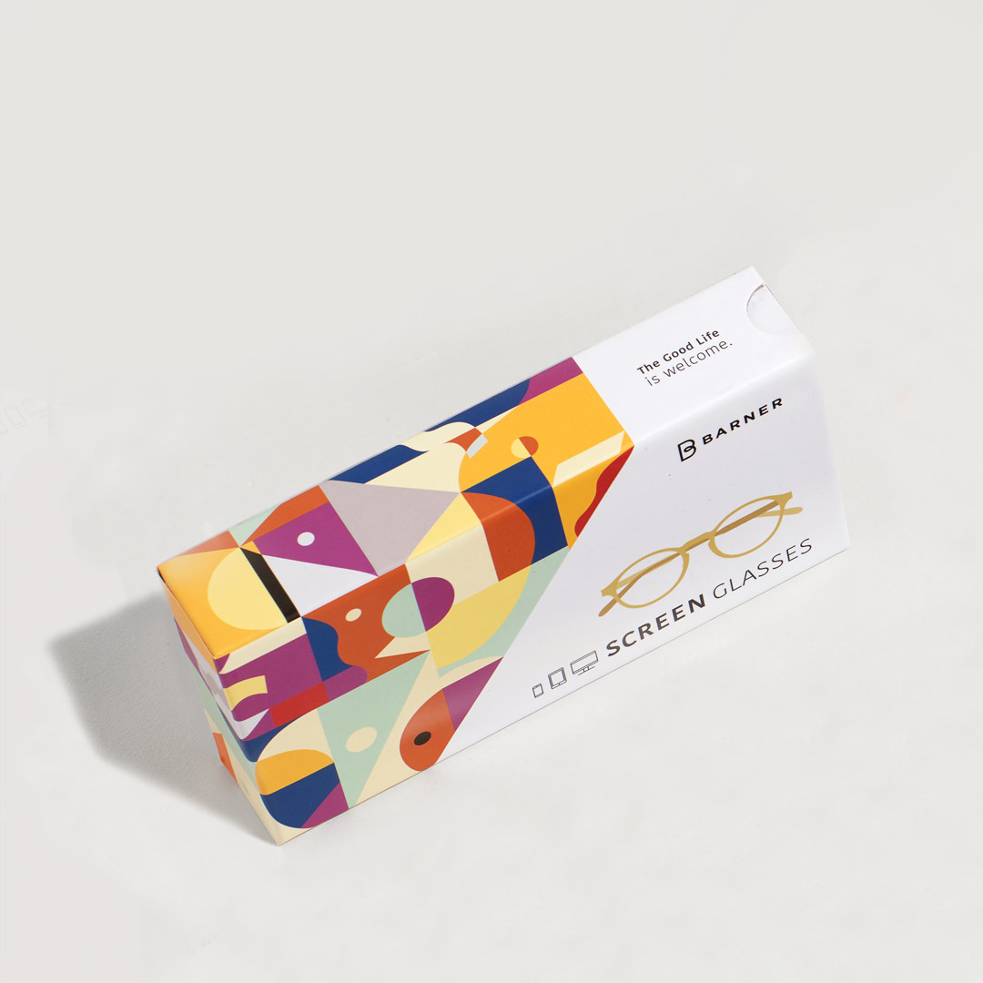
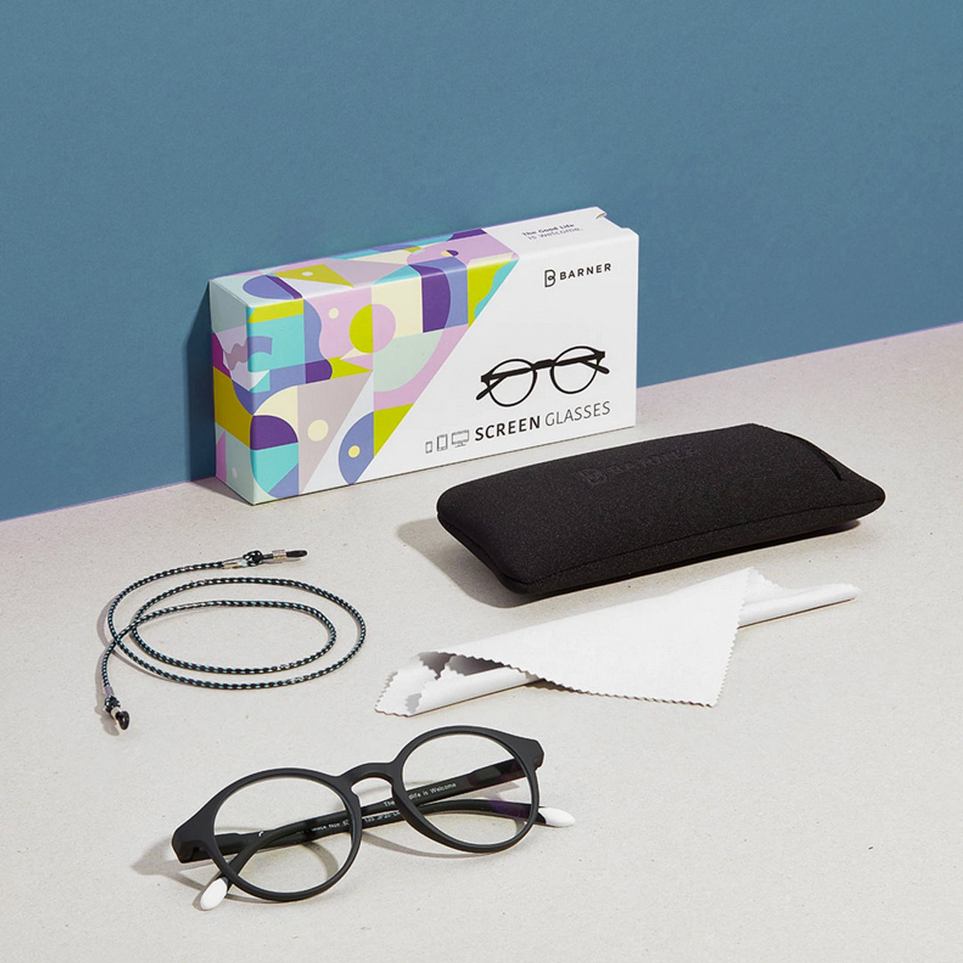
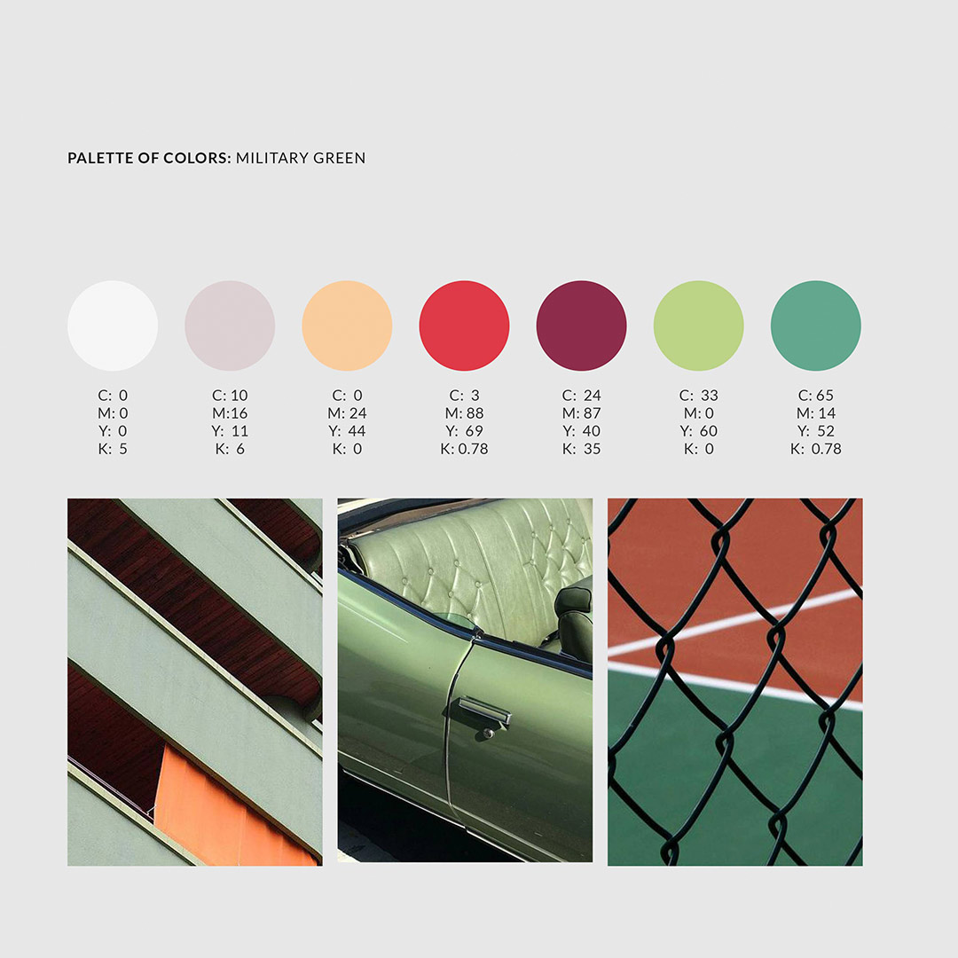
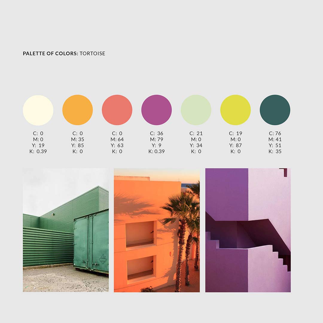
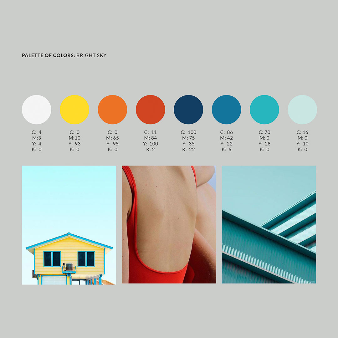
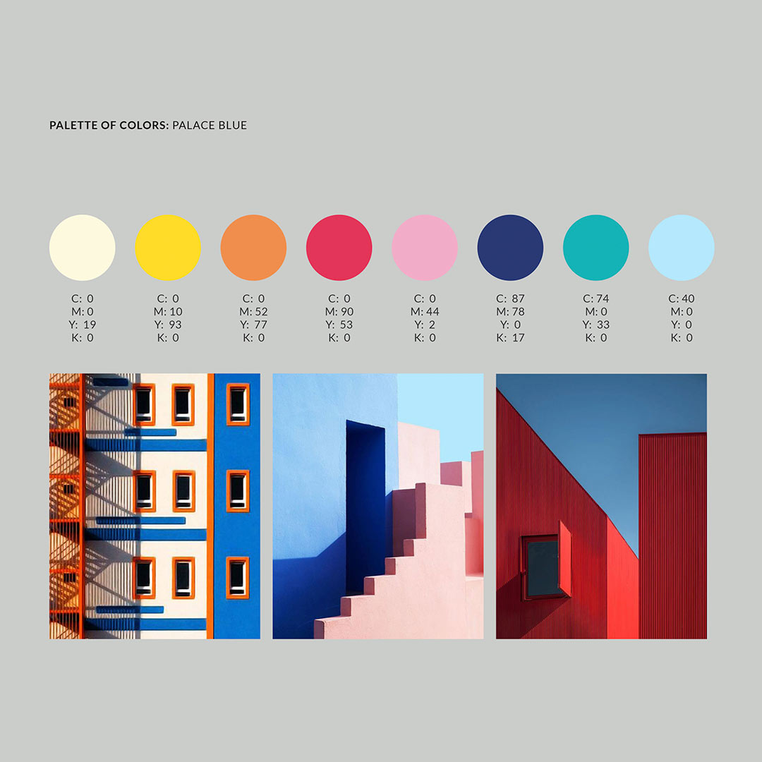
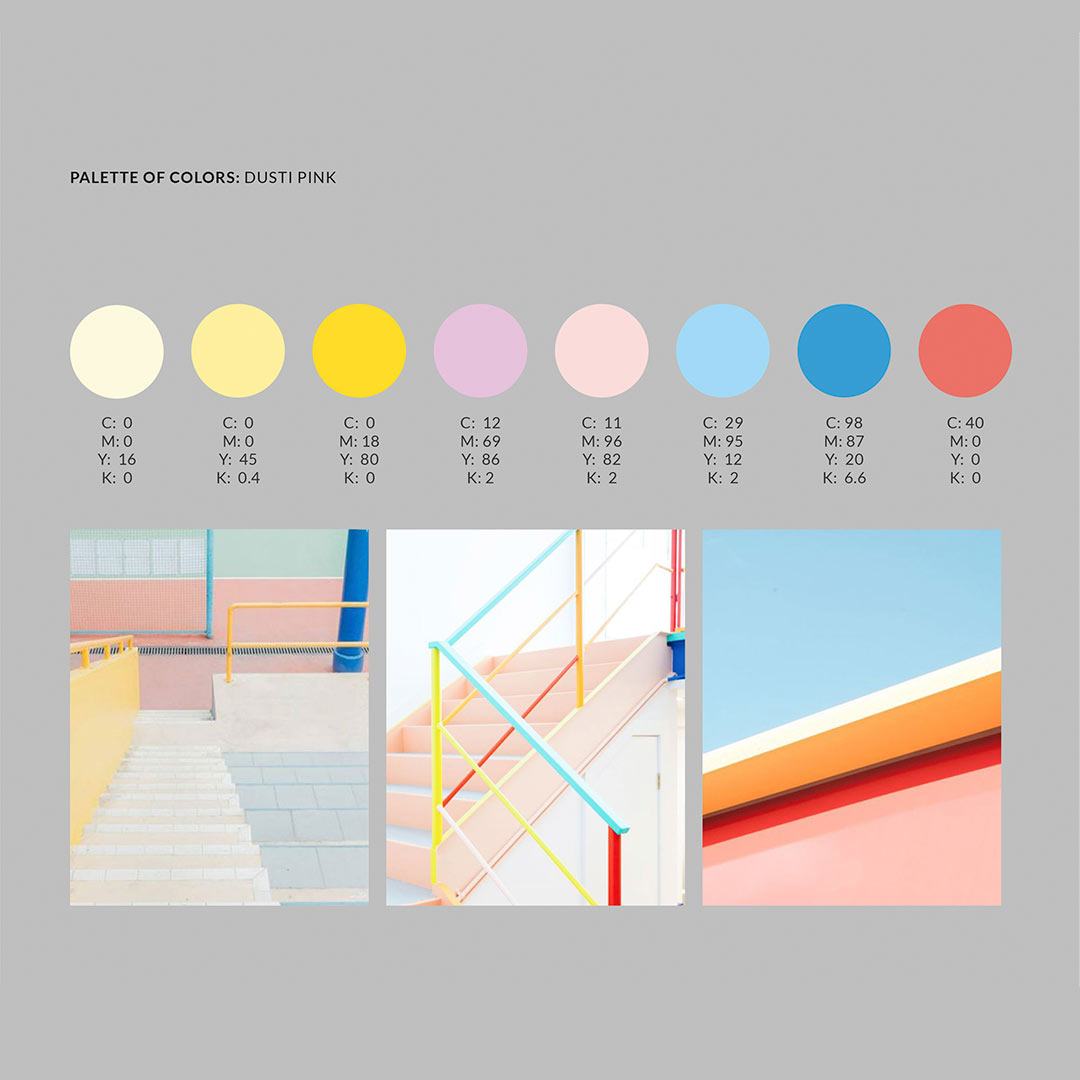
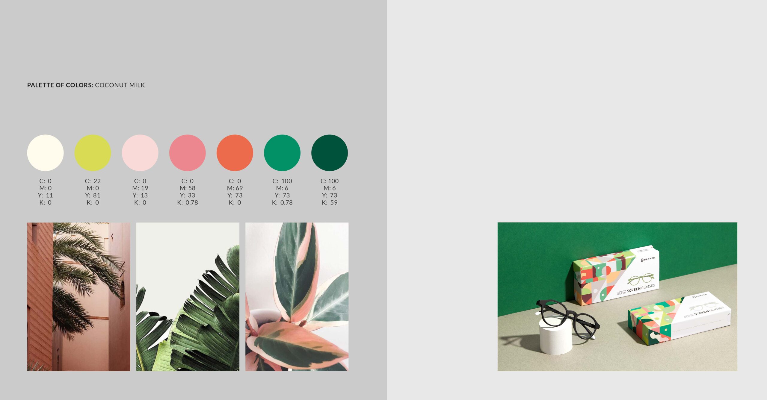
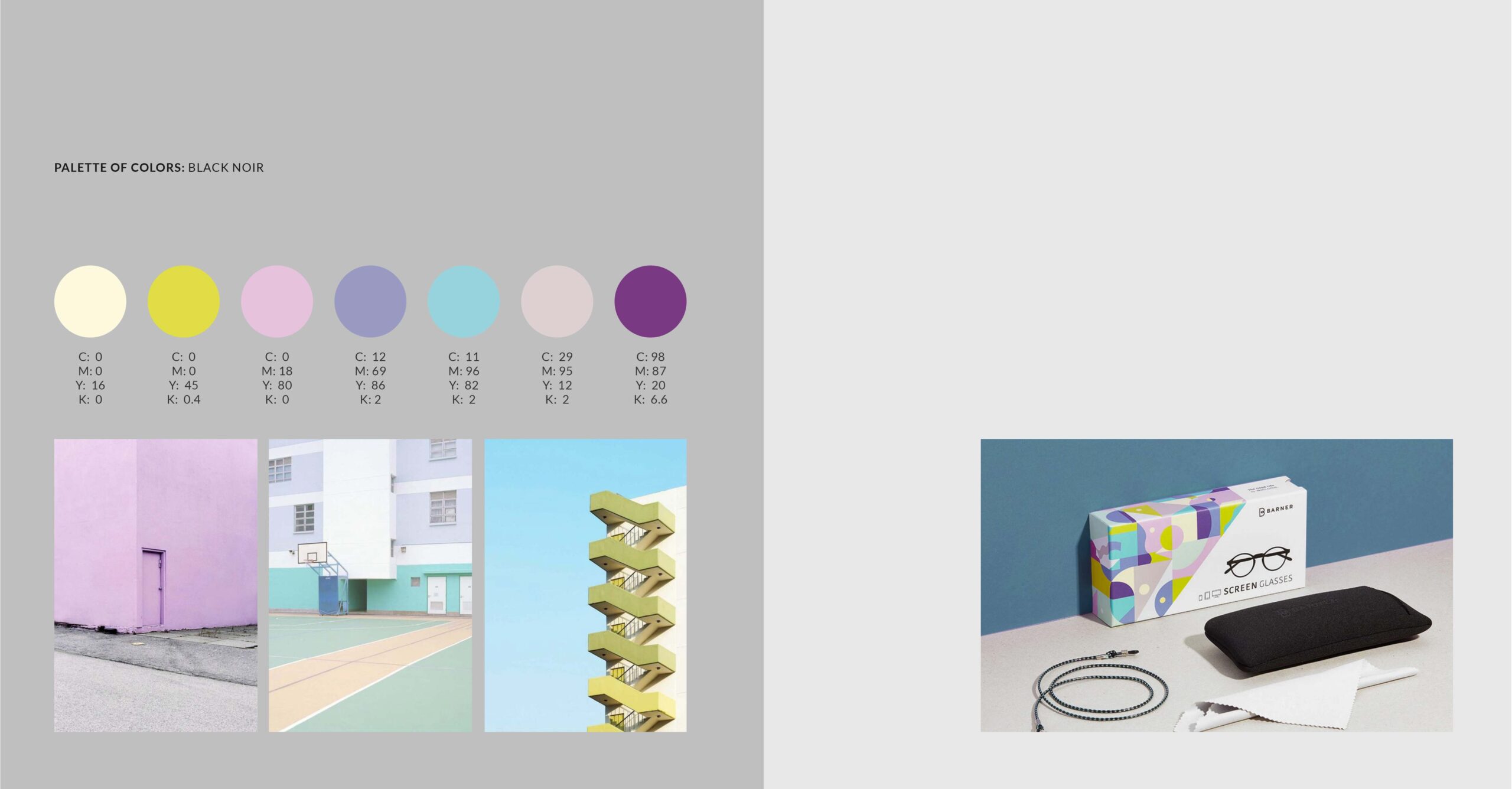
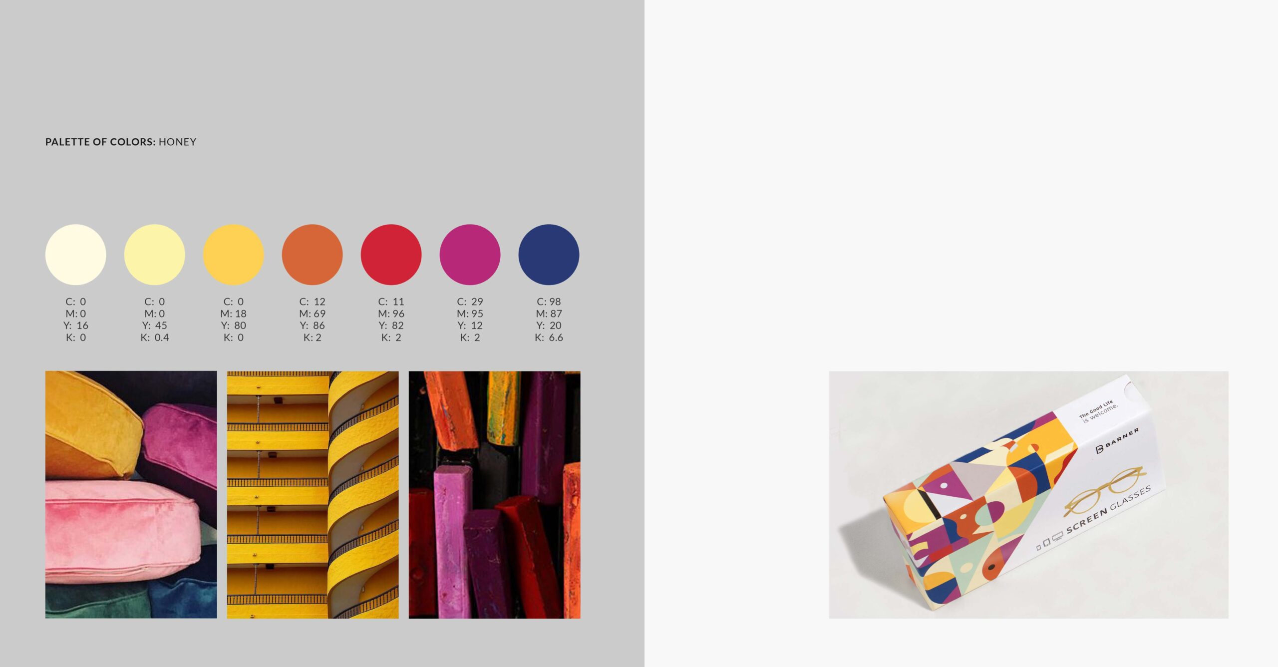
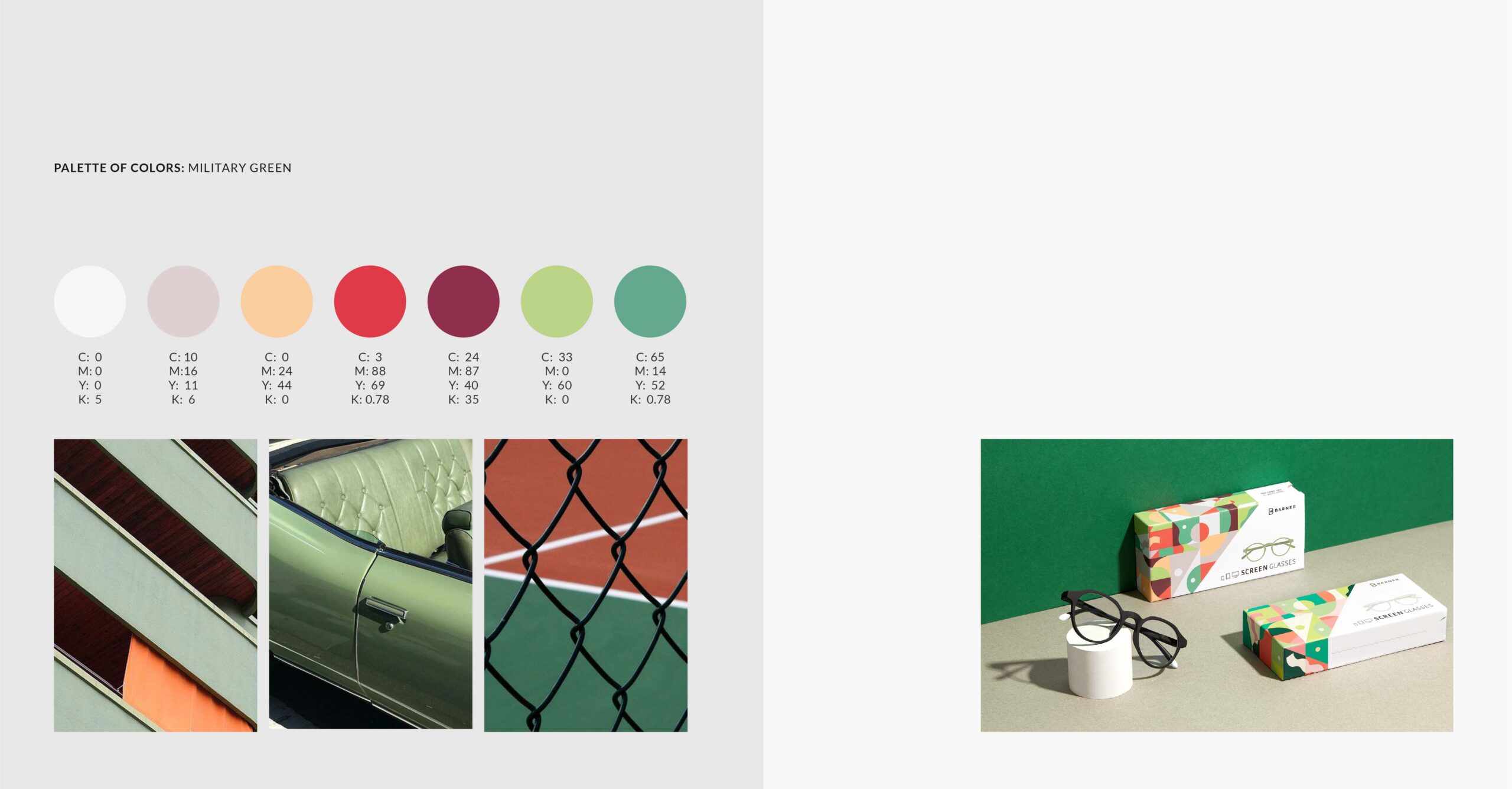
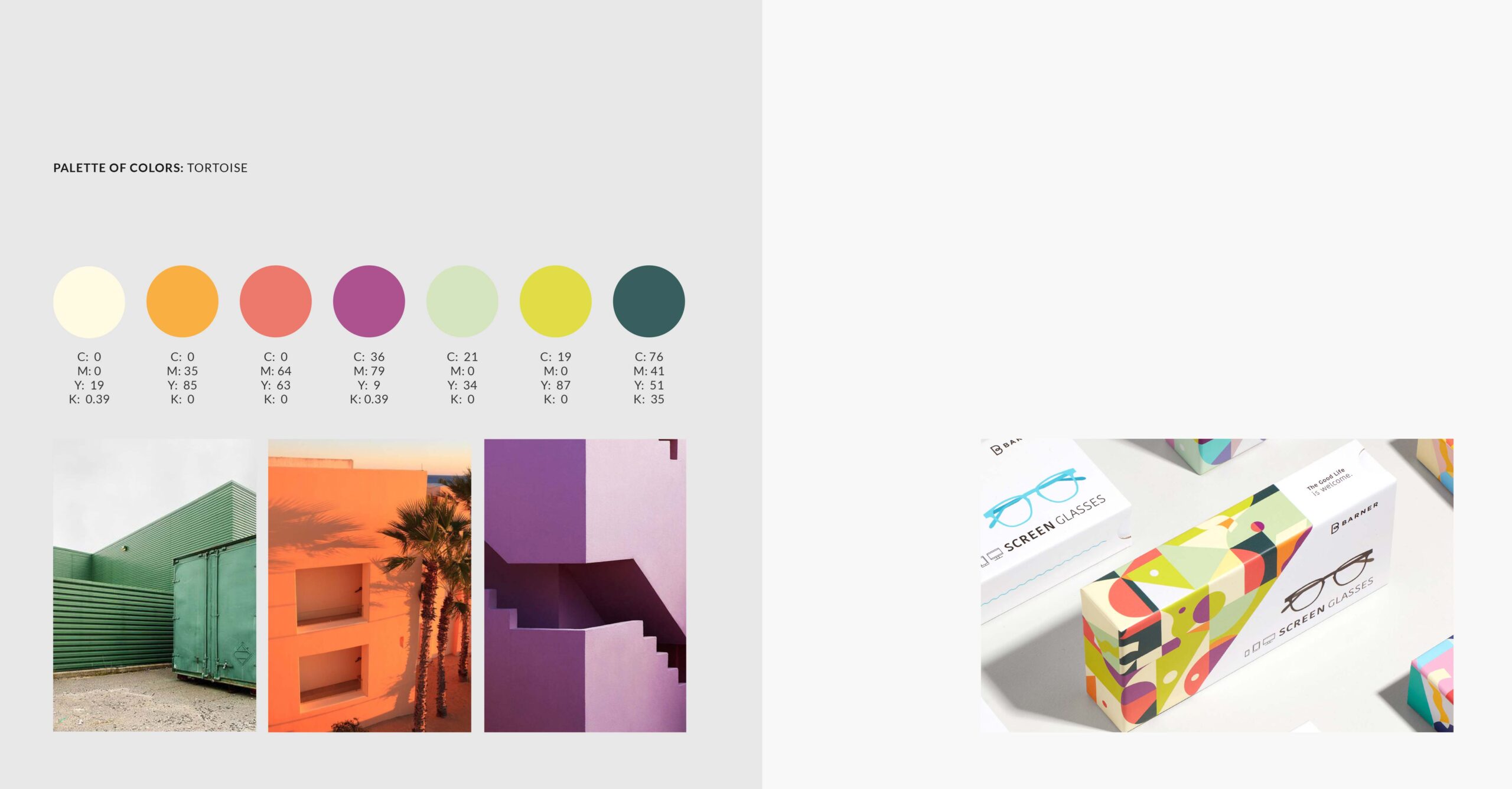
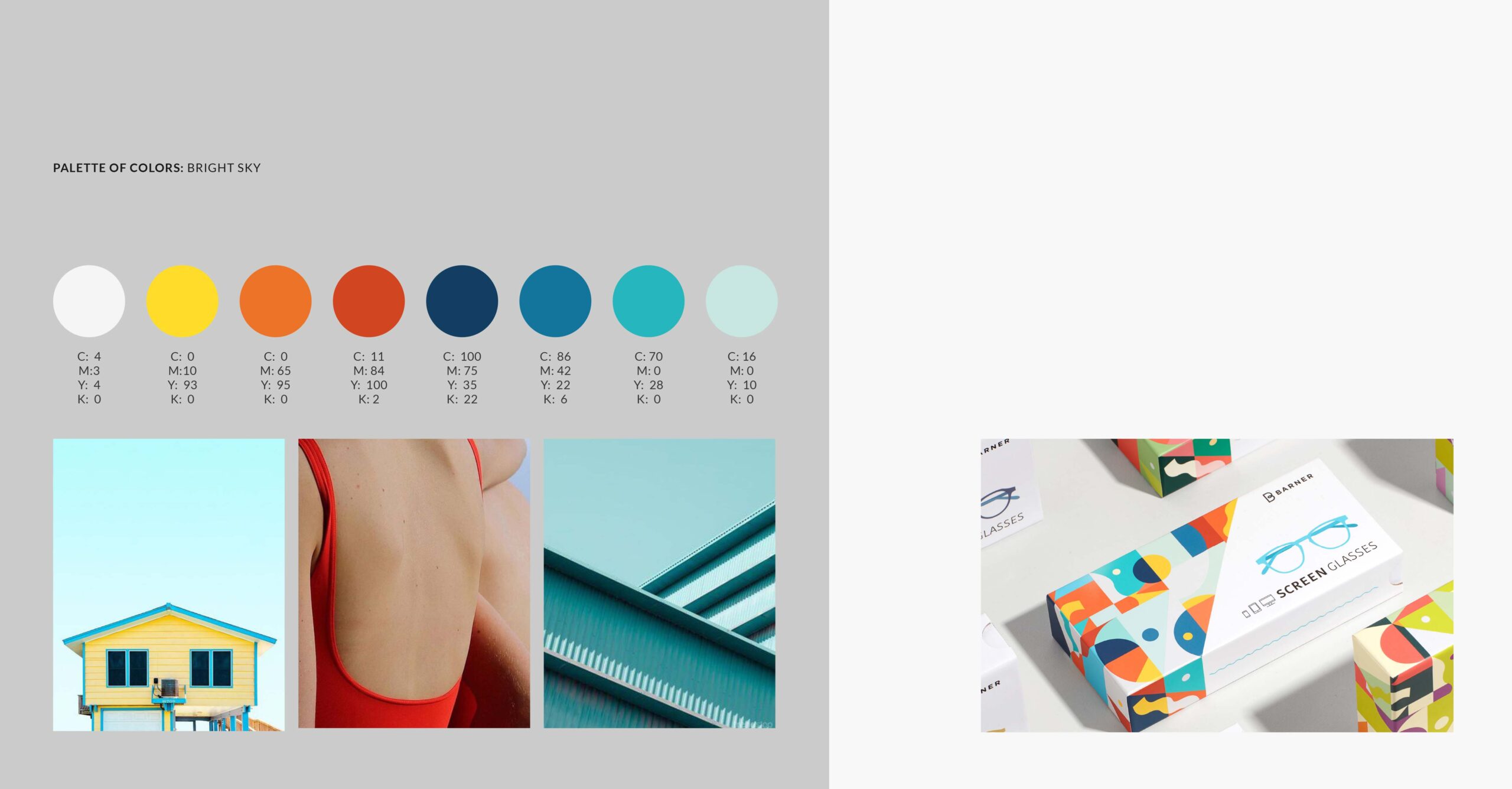
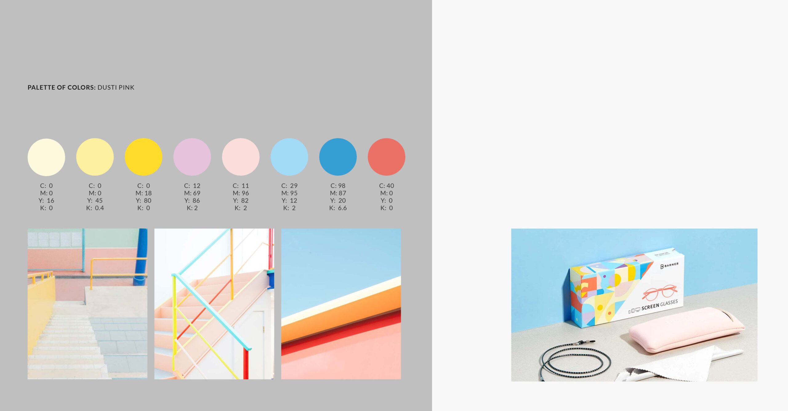
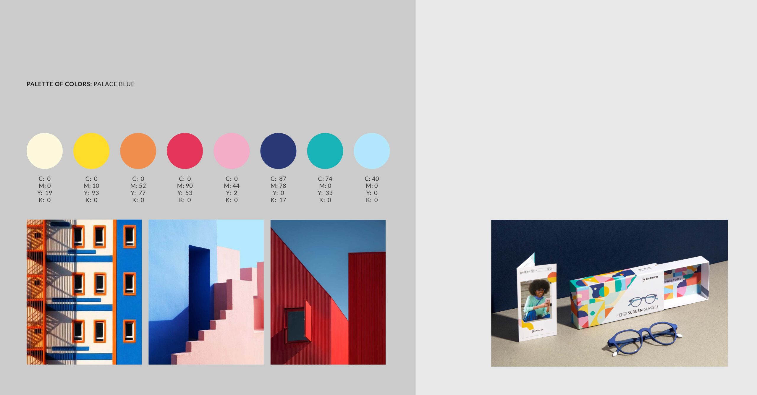
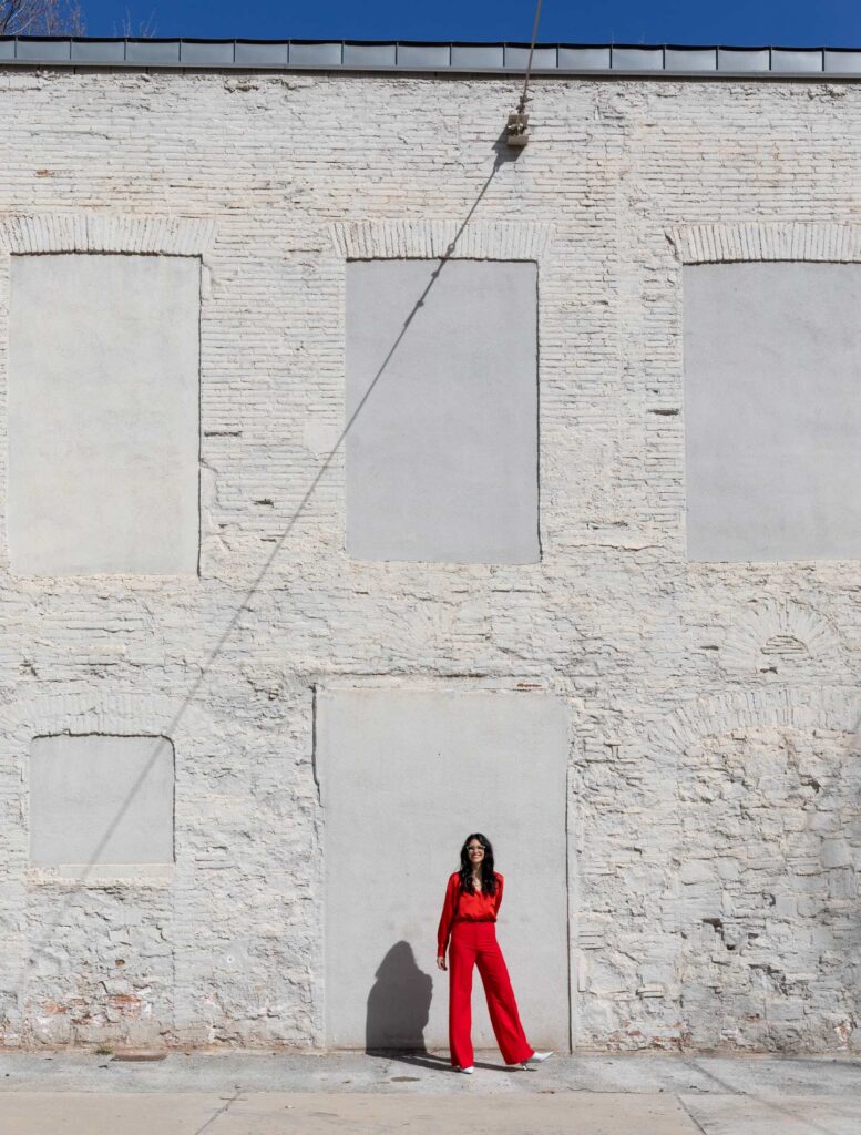
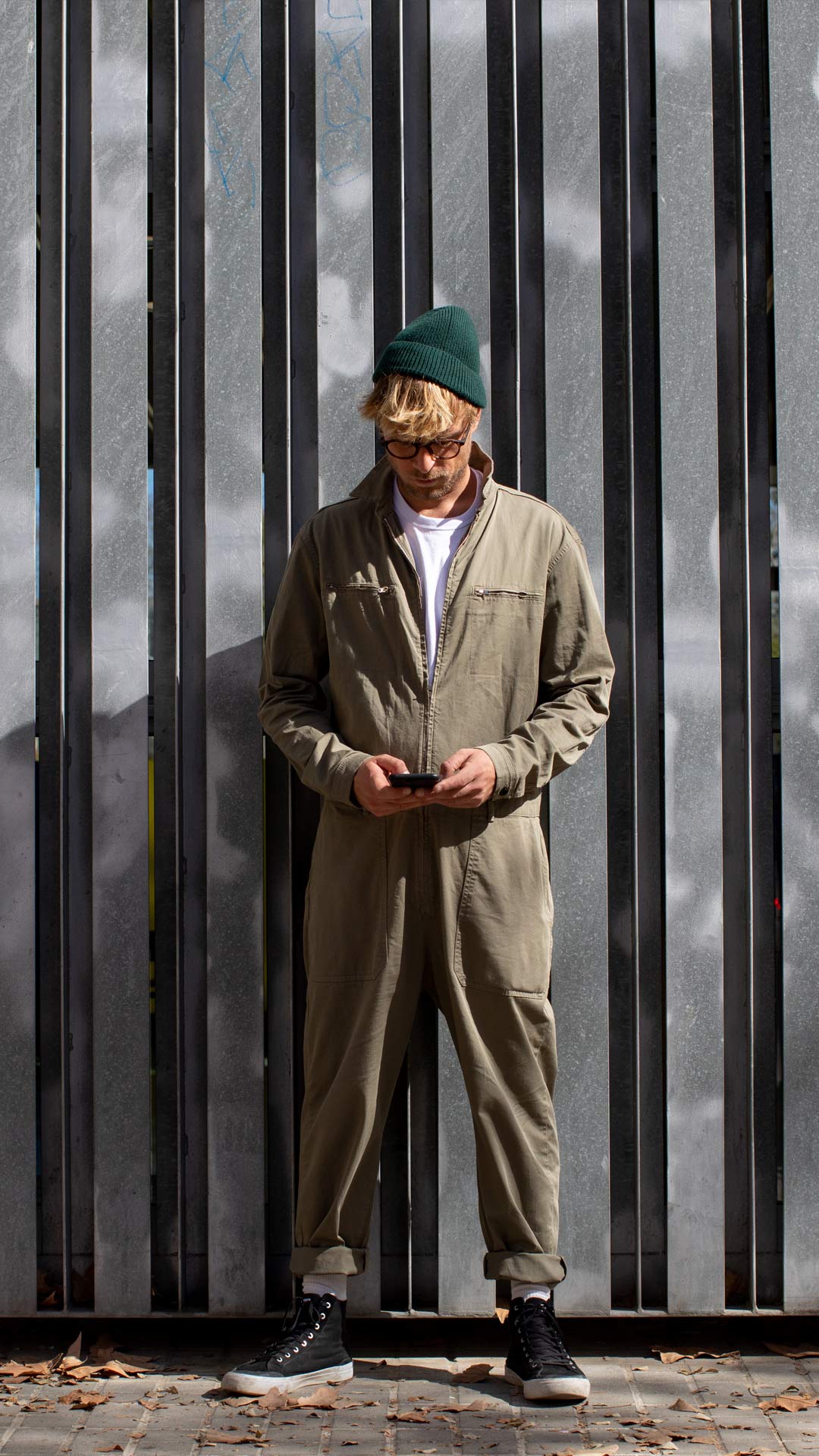
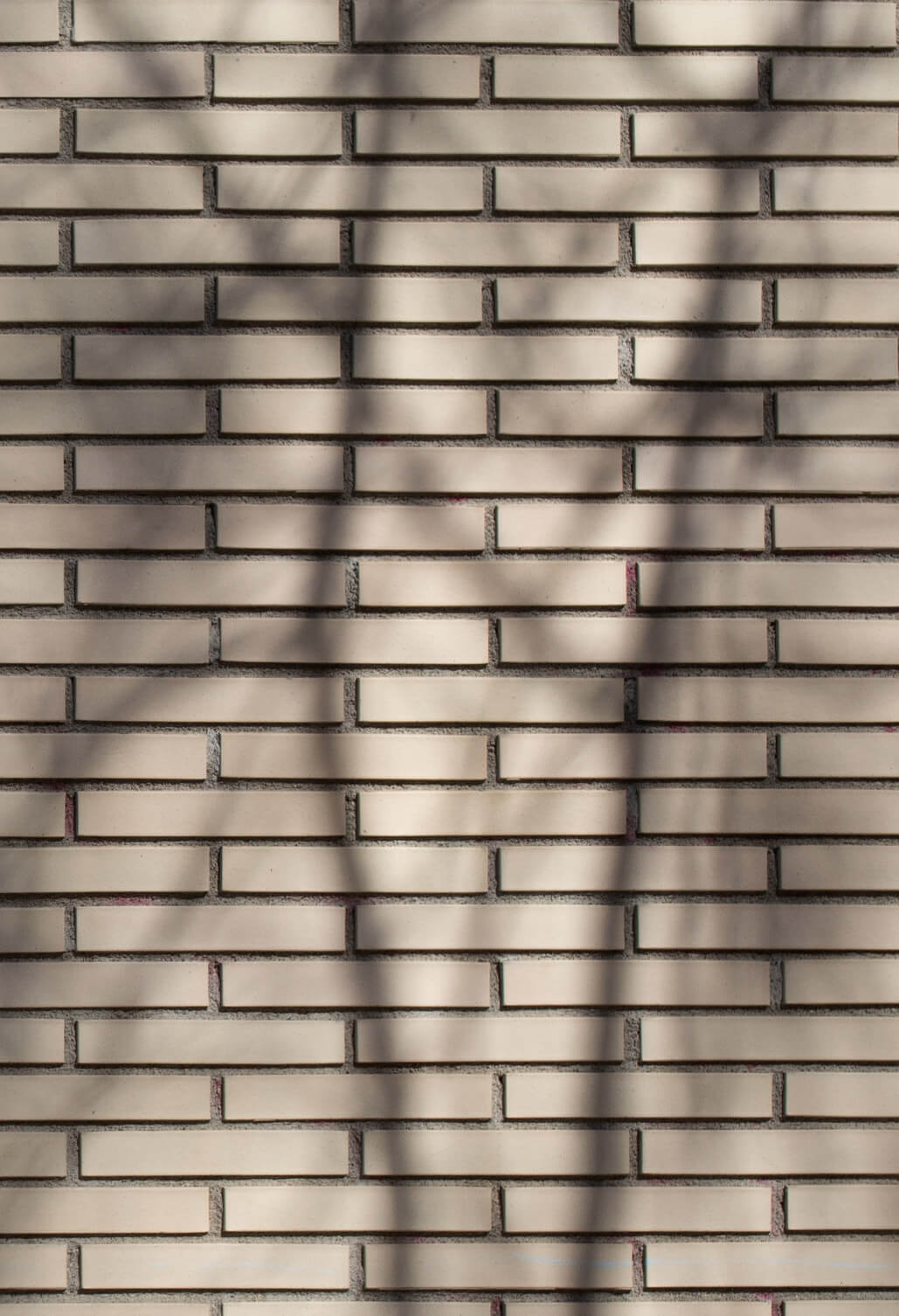
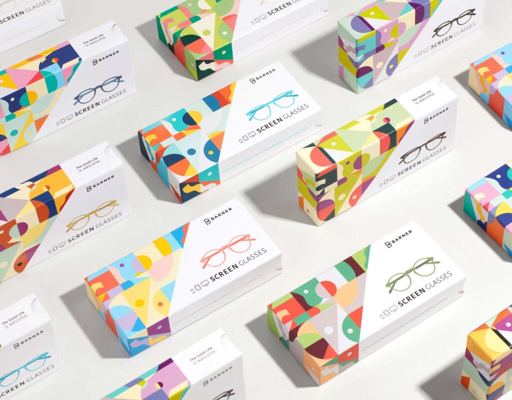
The decision was made to go from high-end acetate frames to more competitive polycarbonate frames, so a new, more functional and vital brand positioning had to be defined, which was condensed into the declaration: ‘The Good Life is welcome’. At the art direction level, we had to build a new visual identity that would convey this same freshness and good vibes, for which we were inspired by the lively geometric patterns of Melbourne.
The decision was made to go from high-end acetate frames to more competitive polycarbonate frames, so a new, more functional and vital brand positioning had to be defined, which was condensed into the declaration: ‘The Good Life is welcome’. At the art direction level, we had to build a new visual identity that would convey this same freshness and good vibes, for which we were inspired by the lively geometric patterns of Melbourne.
The decision was made to go from high-end acetate frames to more competitive polycarbonate frames, so a new, more functional and vital brand positioning had to be defined, which was condensed into the declaration: ‘The Good Life is welcome’. At the art direction level, we had to build a new visual identity that would convey this same freshness and good vibes, for which we were inspired by the lively geometric patterns of Melbourne.

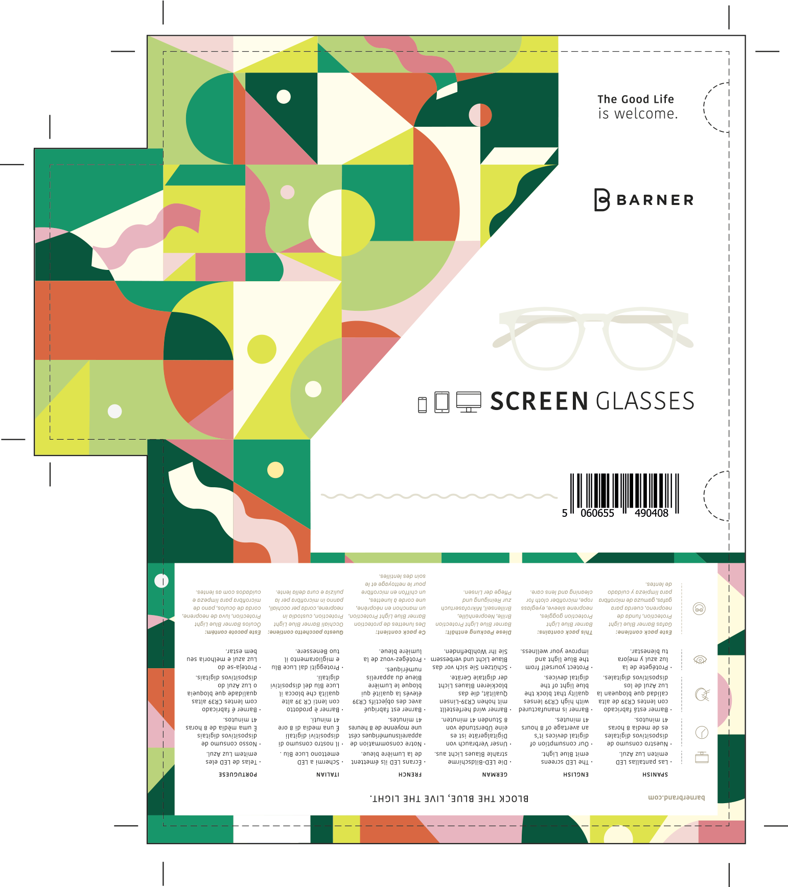
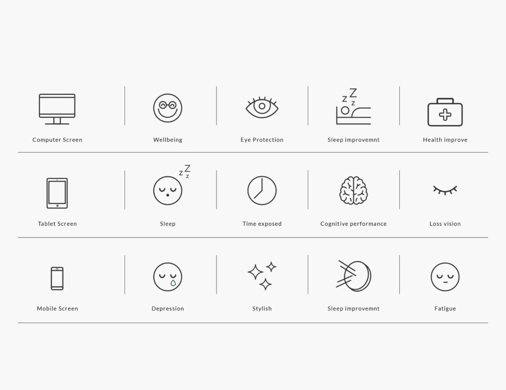
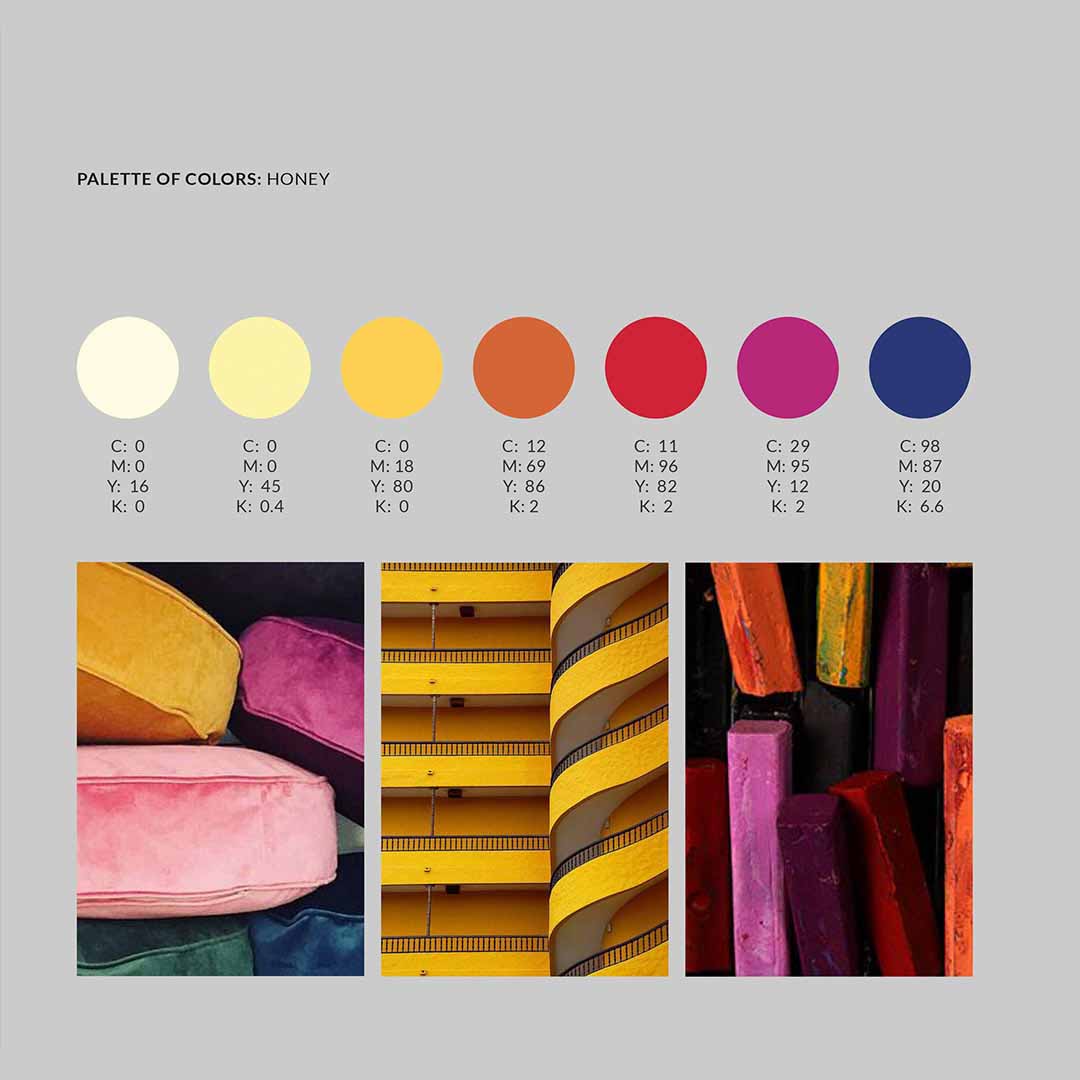
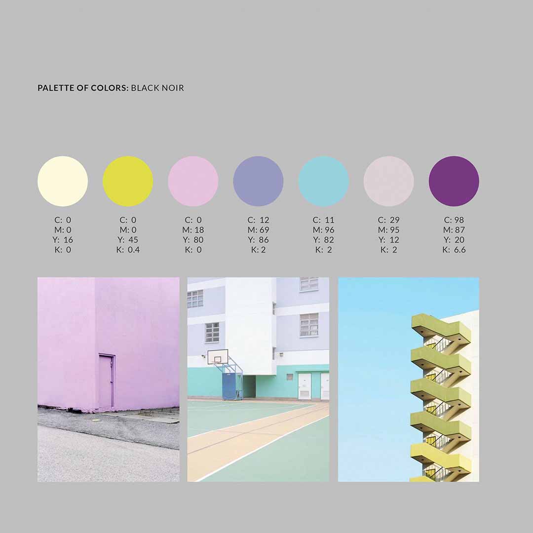
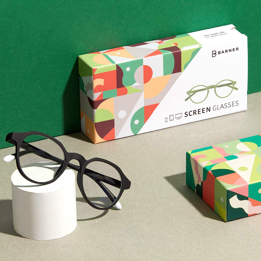
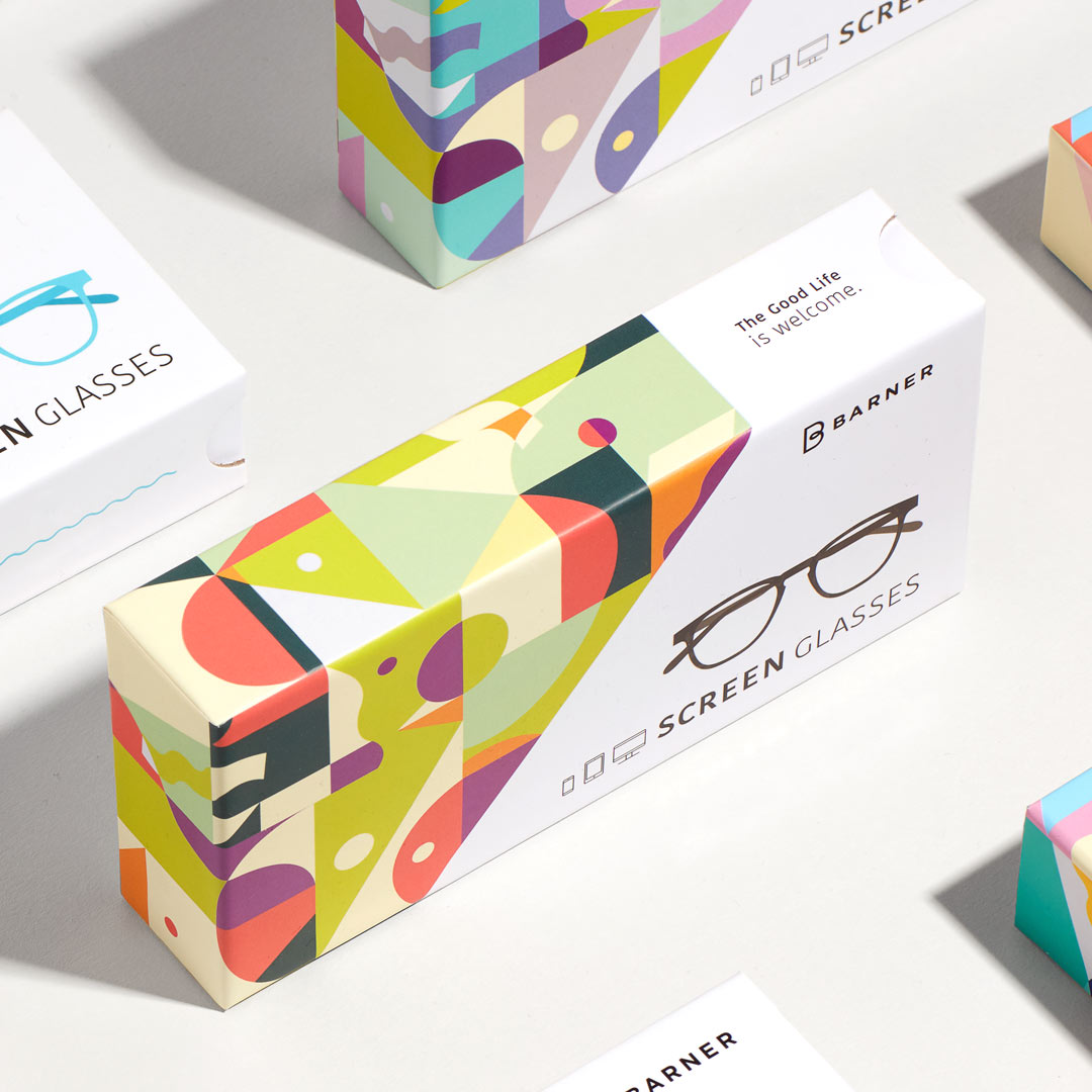
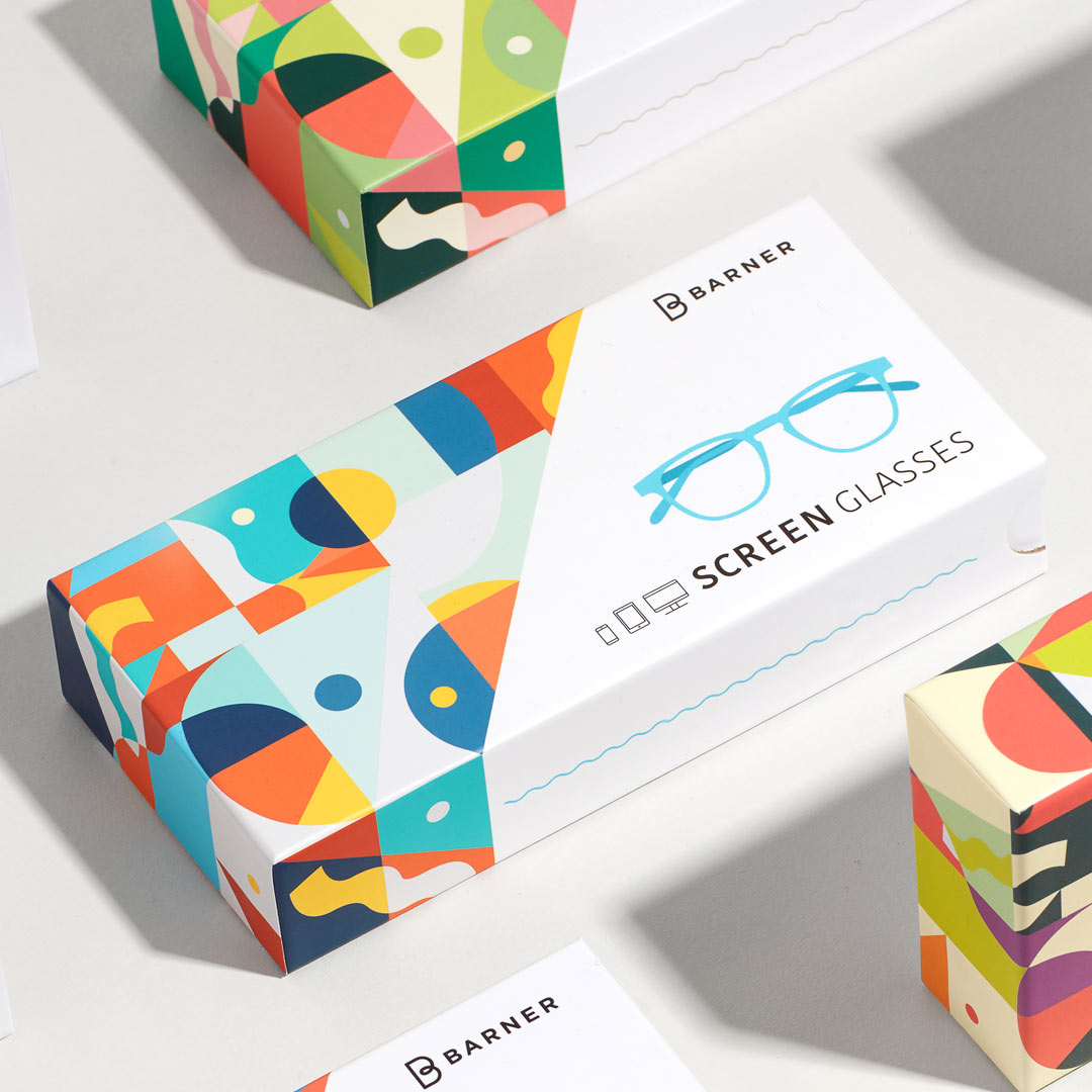
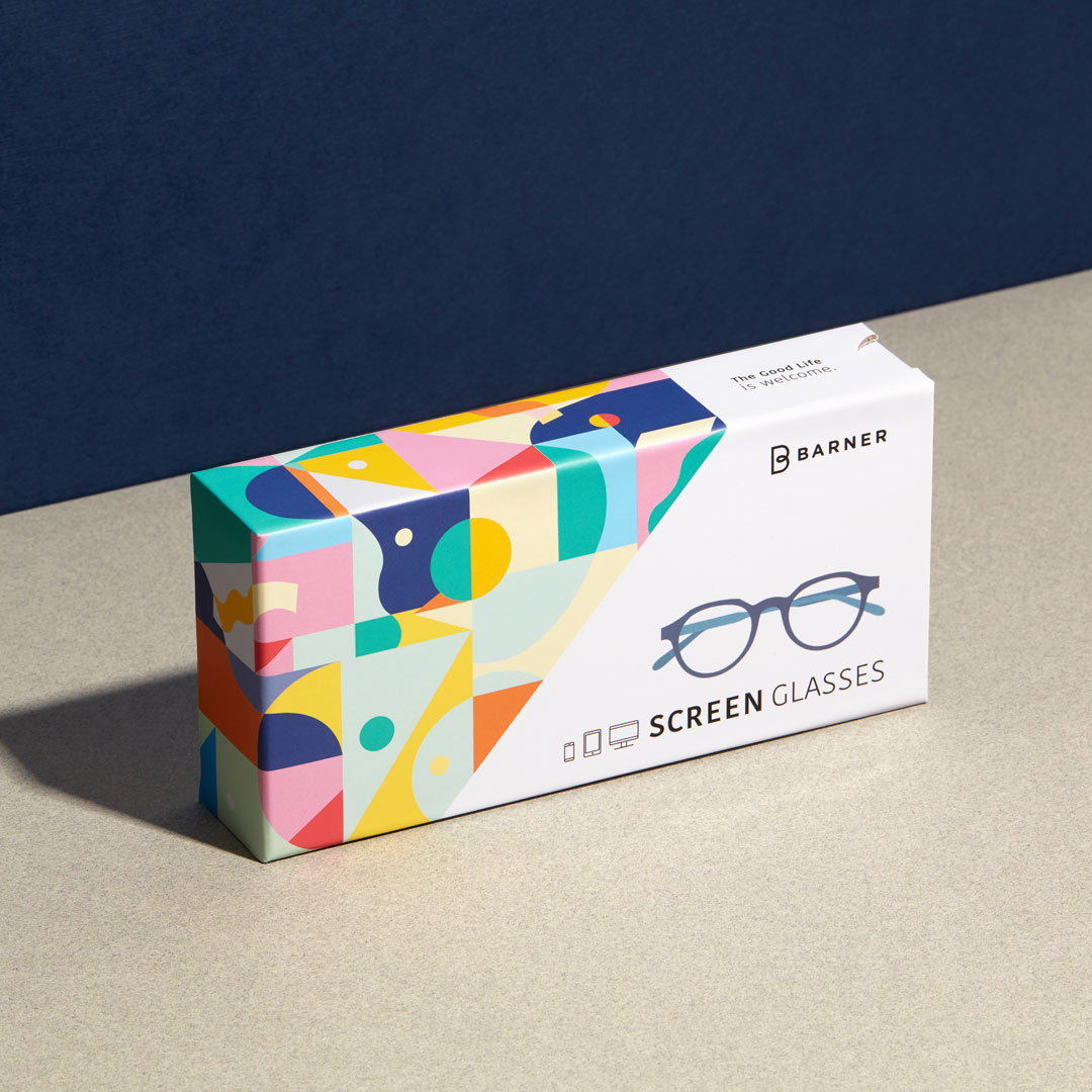
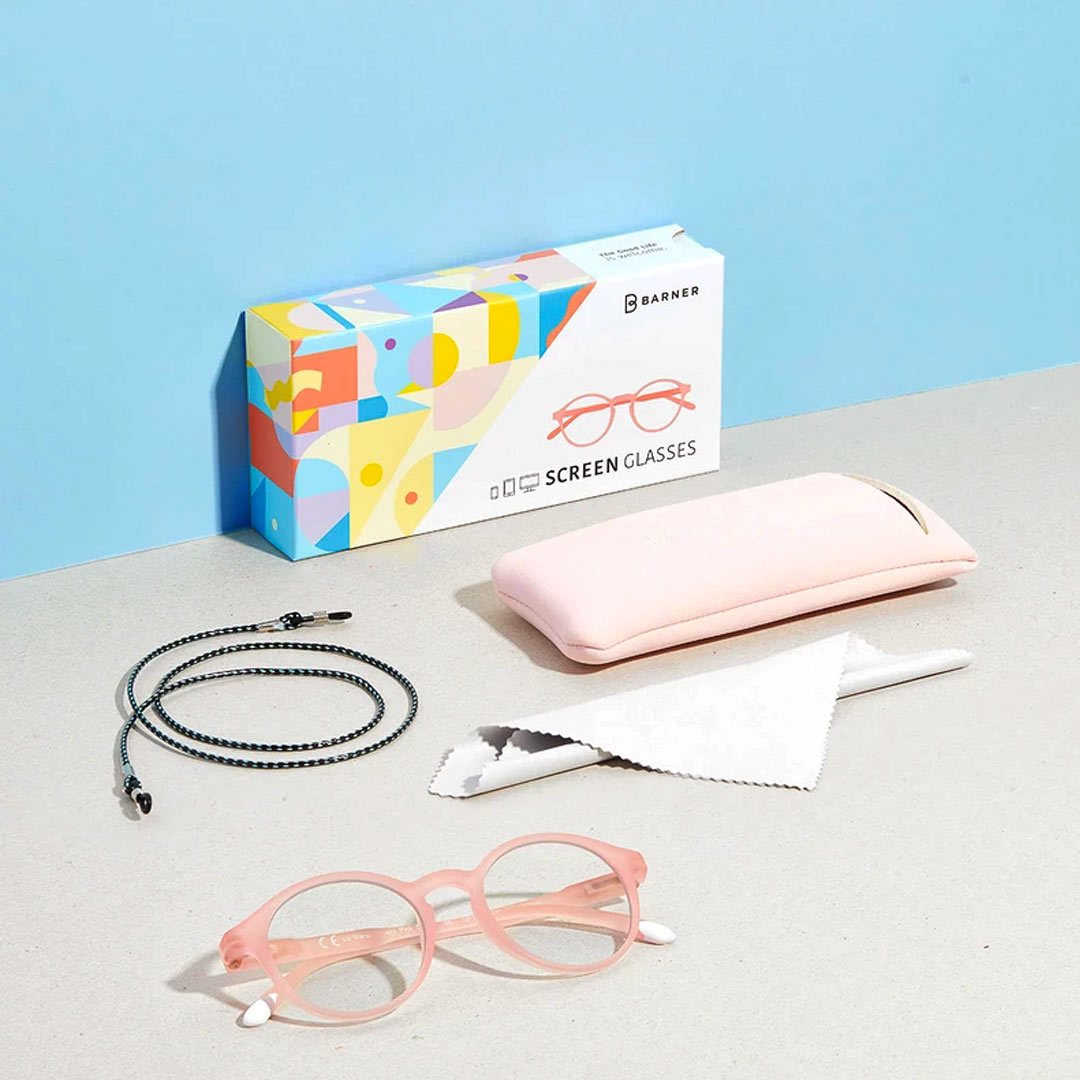
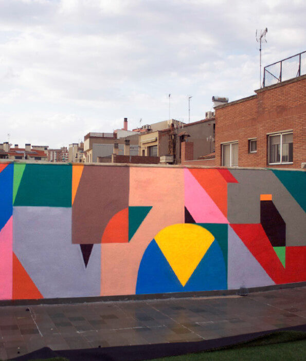
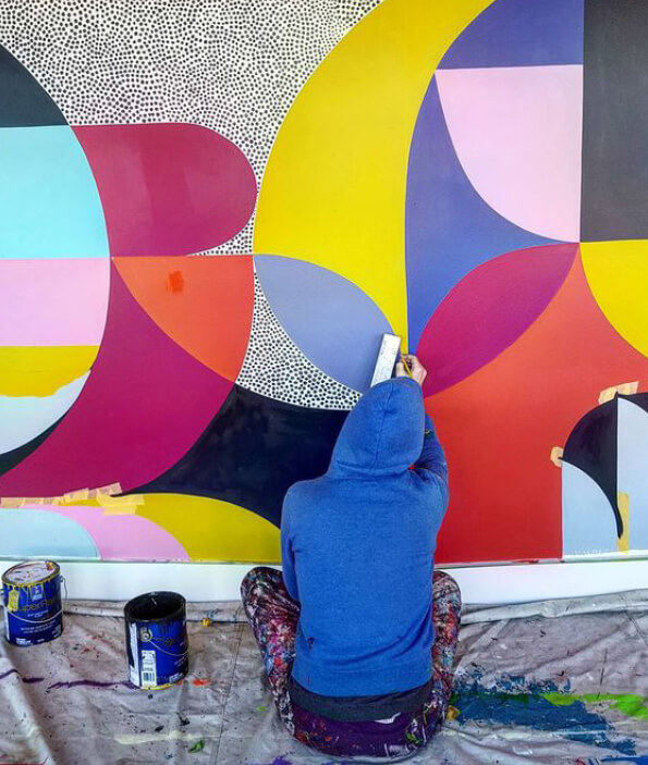
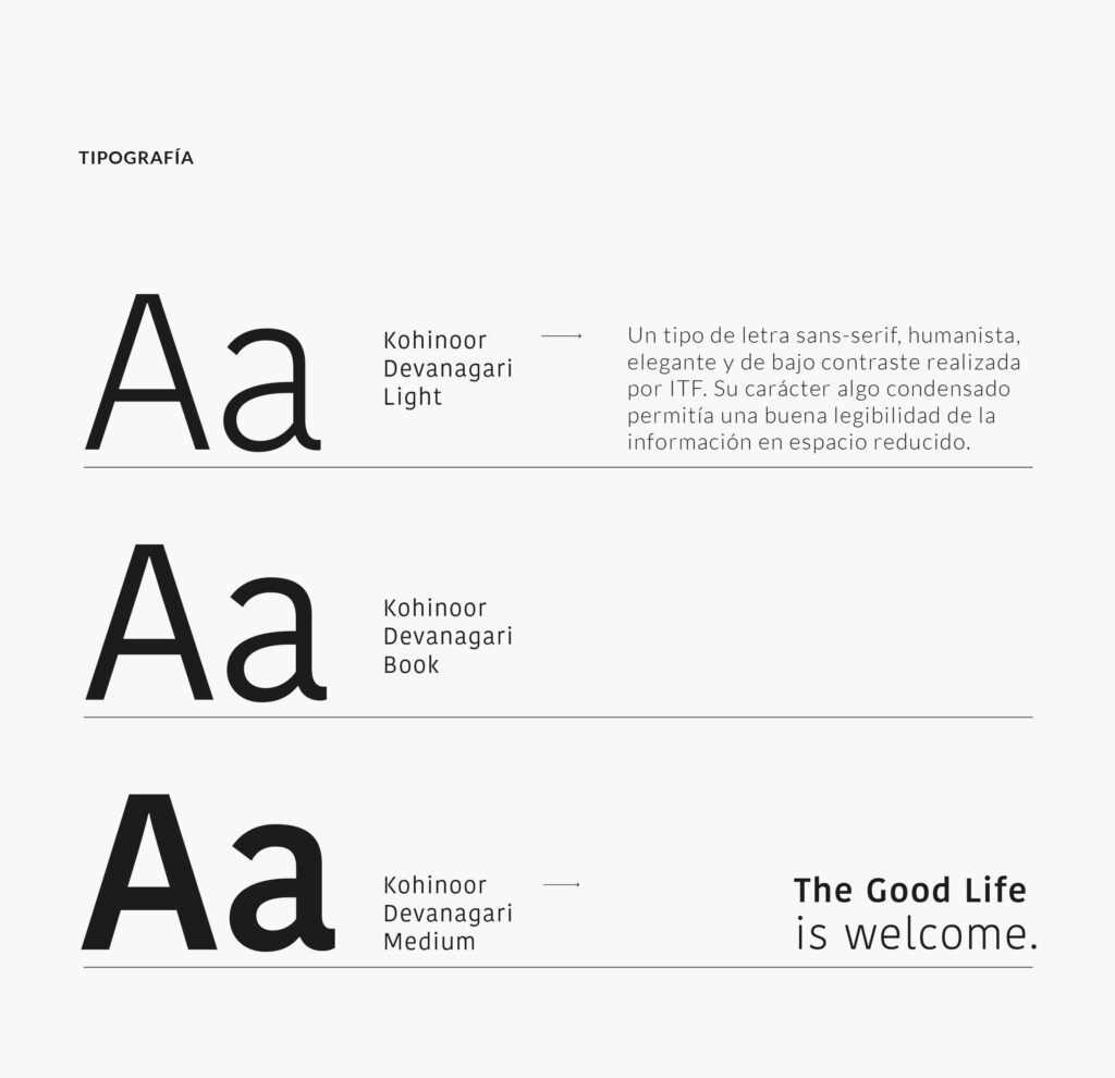
For the packaging we create a geometric pattern with eight different ranges of color according to the tone of each frame. The Kohinoor Devanagari typeface was chosen for its legibility and clean character, and at the iconographic level a friendly yet mature style was developed.

For the packaging we create a geometric pattern with eight different ranges of color according to the tone of each frame. The Kohinoor Devanagari typeface was chosen for its legibility and clean character, and at the iconographic level a friendly yet mature style was developed.
For the packaging we create a geometric pattern with eight different ranges of color according to the tone of each frame. The Kohinoor Devanagari typeface was chosen for its legibility and clean character, and at the iconographic level a friendly yet mature style was developed.