Reflets
SUR LE REGARD
Client: ELOISE EYEWEAR
Model Photographer: CECILIA A.H. ARIAS
Product Photographer: IVAN CASTER
Model: STEFANIA CHRISTIAN
Make Up: LAIA MARTIN, CRUZ SUS
Art Direction: AMAIA F.GOROSTIZA
Amaia F. Gorostiza – Art Direction and Design
Art Direction Portfolio of Amaia Fernández de Gorostiza
Client: ELOISE EYEWEAR
Model Photographer: CECILIA A.H. ARIAS
Product Photographer: IVAN CASTER
Model: STEFANIA CHRISTIAN
Make Up: LAIA MARTIN, CRUZ SUS
Art Direction: AMAIA F.GOROSTIZA
Client: ELOISE EYEWEAR
Model Photographer: CECILIA A.H. ARIAS
Product Photographer: IVAN CASTER
Model: STEFANIA CHRISTIAN
Make Up: LAIA MARTIN, CRUZ SUS
Art Direction: AMAIA F.GOROSTIZA
Client: ELOISE EYEWEAR
Model Photographer: CECILIA A.H. ARIAS
Product Photographer: IVAN CASTER
Model: STEFANIA CHRISTIAN
Make Up: LAIA MARTIN, CRUZ SUS
Art Direction: AMAIA F.GOROSTIZA

It’s impossible
to obtain
clear images
when your ideas
are diffuse.
Jean-Luc Godard
It’s impossible
to obtain
clear images
when your ideas
are diffuse.
Jean-Luc Godard


It’s impossible
to obtain
clear images
when your ideas
are diffuse.
Jean-Luc Godard
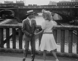
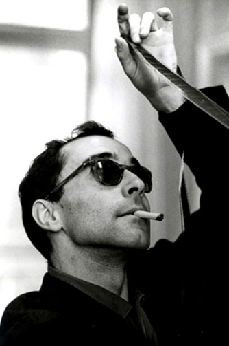
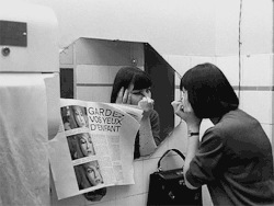
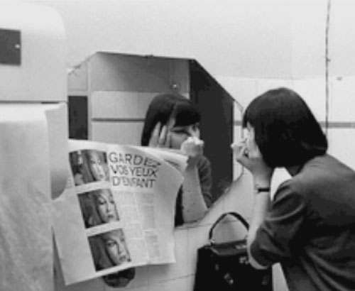
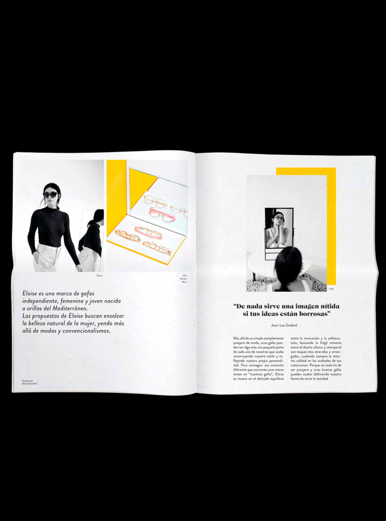
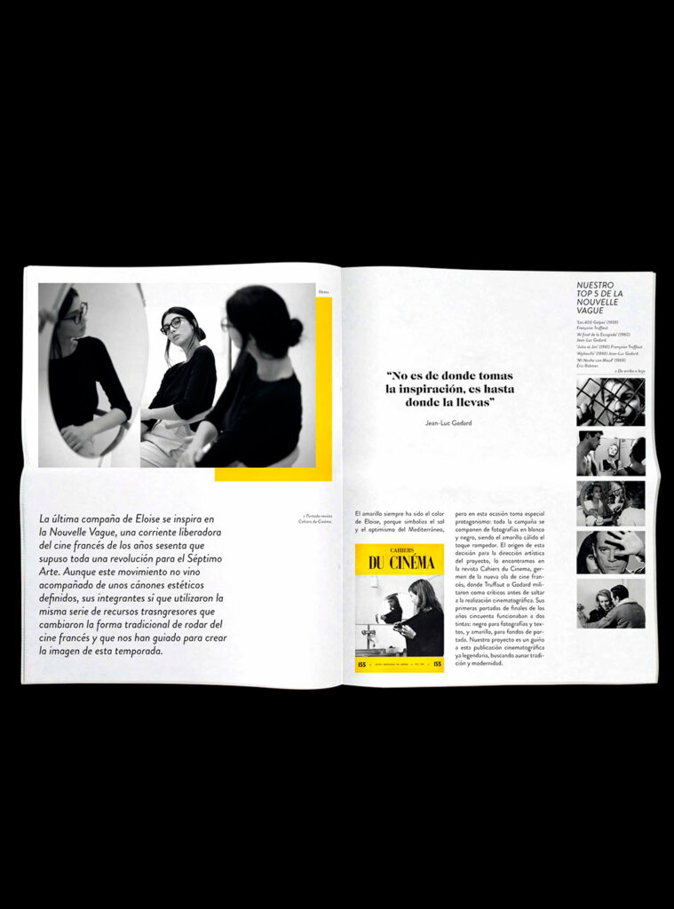
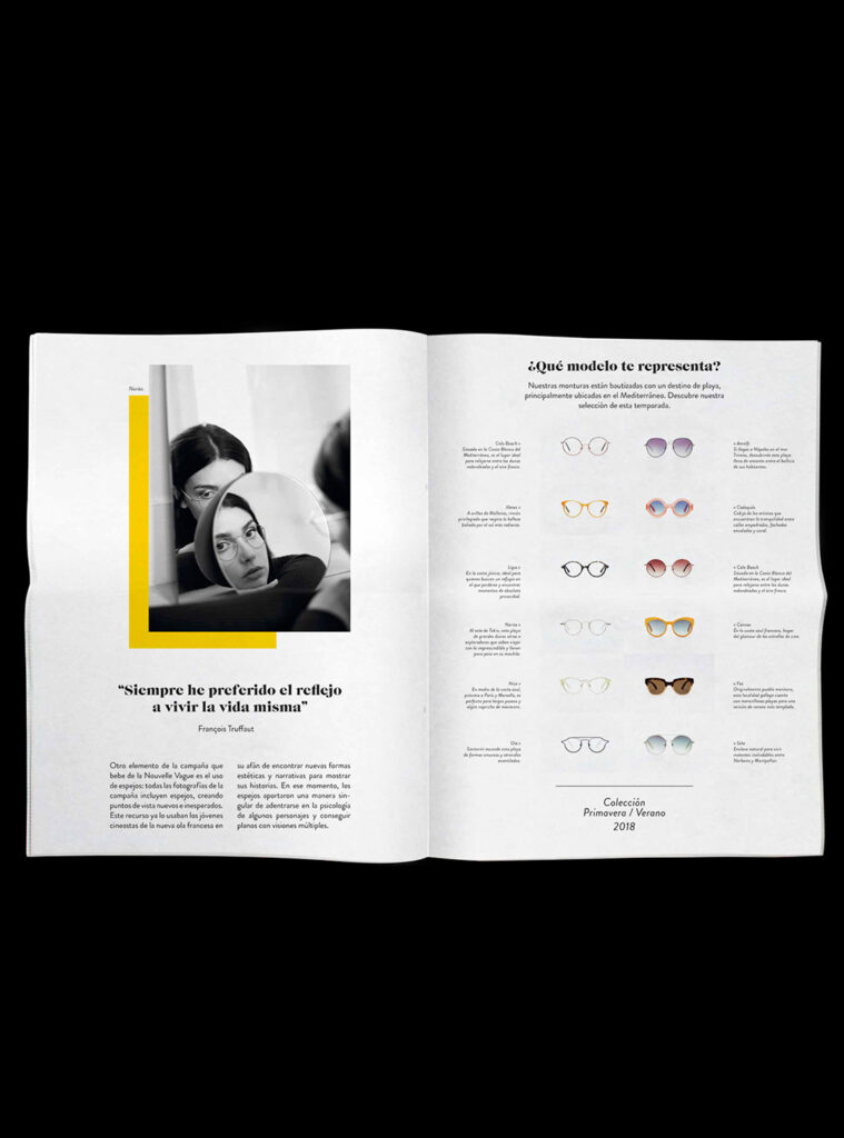
In Agnès Varda’s gorgeous film“Cleo from 5 to 7”, Jean-Luc Godard stars in a silent short in which his character, after putting on black sunglasses, begins to perceive his surroundings from a fatalistic viewpoint. Luckily, after a few humorous incidents,
In Agnès Varda’s gorgeous film“Cleo from 5 to 7”, Jean-Luc Godard stars in a silent short in which his character, after putting on black sunglasses, begins to perceive his surroundings from a fatalistic viewpoint. Luckily, after a few humorous incidents,
In Agnès Varda’s gorgeous film“Cleo from 5 to 7”, Jean-Luc Godard stars in a silent short in which his character, after putting on black sunglasses, begins to perceive his surroundings from a fatalistic viewpoint. Luckily, after a few humorous incidents,
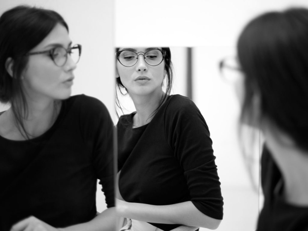
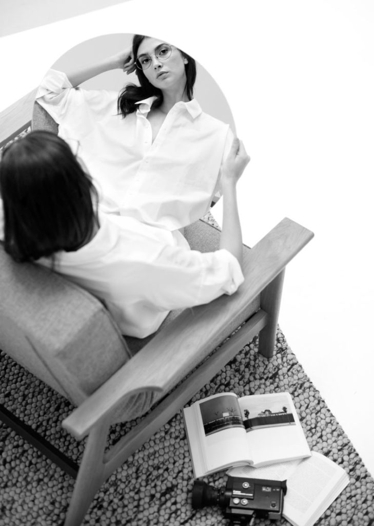
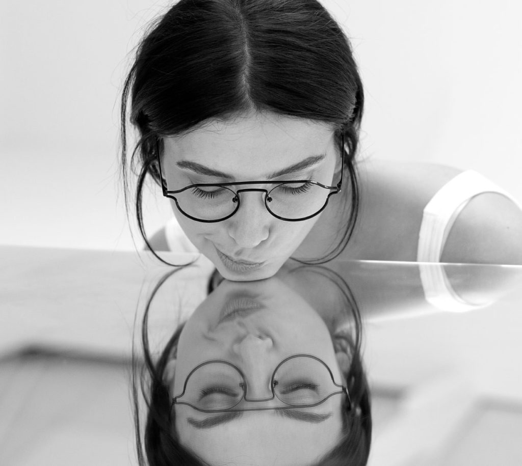
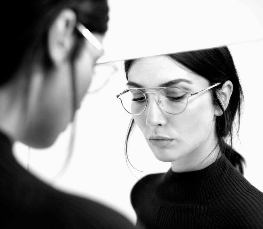
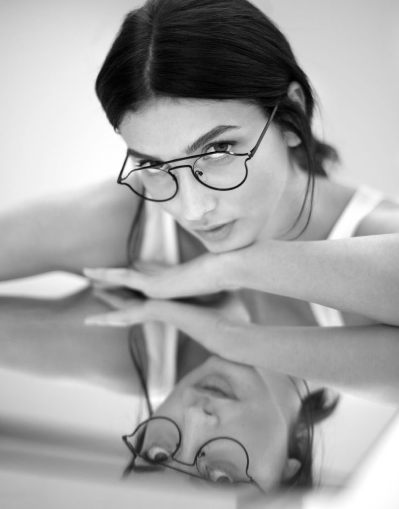
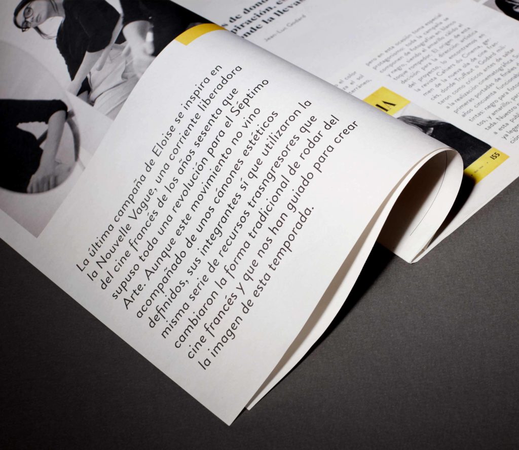
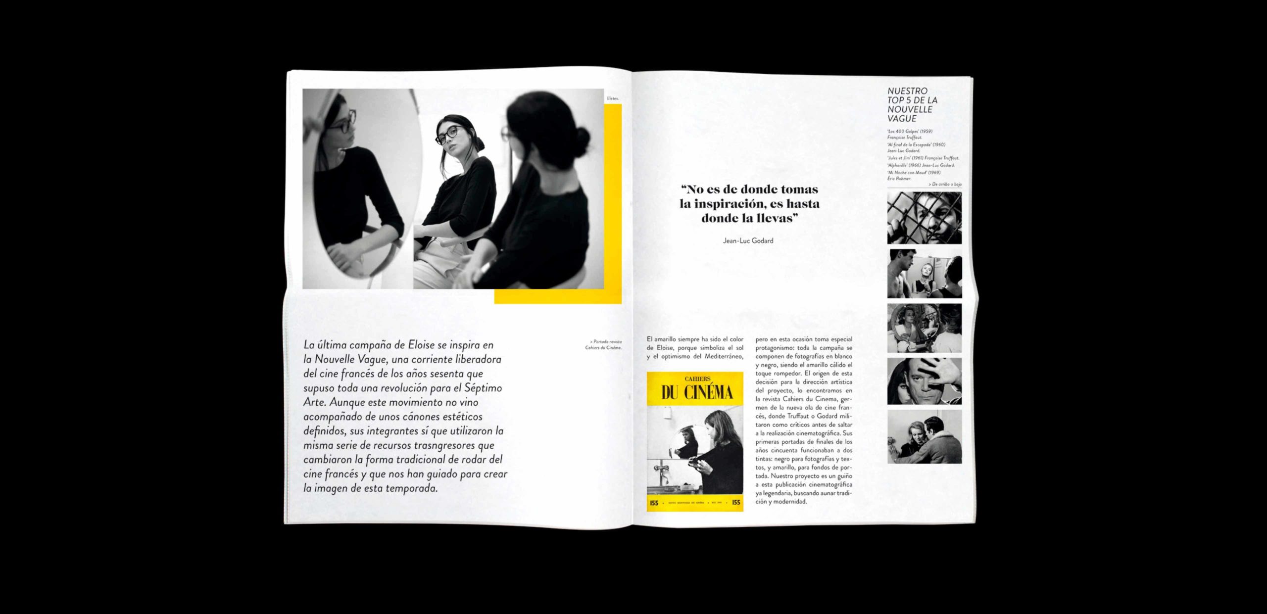
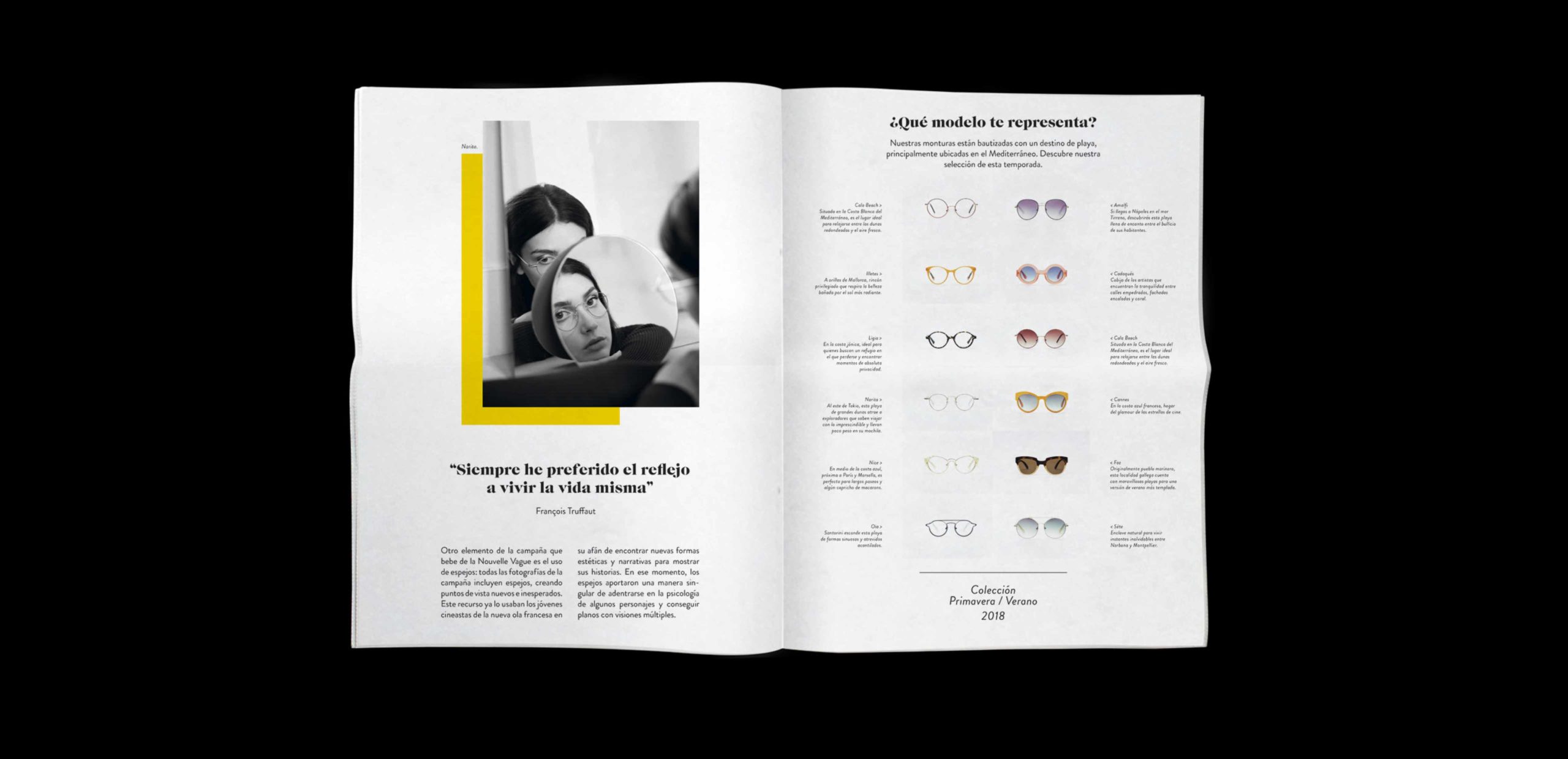
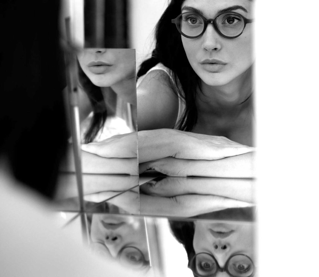
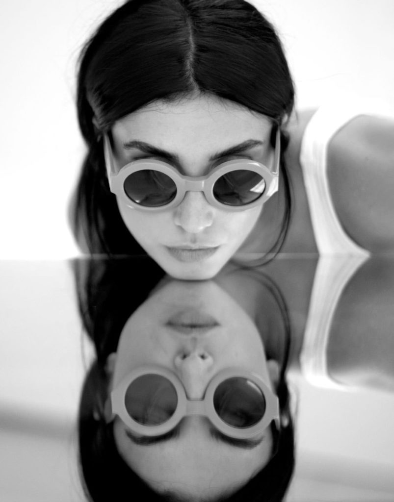
he ends up realizing that in order to perceive the world with optimism again, it wasn’t reality he had to change, but rather the glasses through which he perceived it. The Eloise campaign was inspired by this fresh, transgressive French movement of the “Nouvelle Vague” young filmmakers who dared to innovate the way of filming and composing films, revolutionizing the way audiences see. Art direction was based on the visual codes of the magazine Cahiers du Cinema, playing with mirrors, black and white photos, and large blocks of yellow.
he ends up realizing that in order to perceive the world with optimism again, it wasn’t reality he had to change, but rather the glasses through which he perceived it. The Eloise campaign was inspired by this fresh, transgressive French movement of the “Nouvelle Vague” young filmmakers who dared to innovate the way of filming and composing films, revolutionizing the way audiences see. Art direction was based on the visual codes of the magazine Cahiers du Cinema, playing with mirrors, black and white photos, and large blocks of yellow.


he ends up realizing that in order to perceive the world with optimism again, it wasn’t reality he had to change, but rather the glasses through which he perceived it. The Eloise campaign was inspired by this fresh, transgressive French movement of the “Nouvelle Vague” young filmmakers who dared to innovate the way of filming and composing films, revolutionizing the way audiences see. Art direction was based on the visual codes of the magazine Cahiers du Cinema, playing with mirrors, black and white photos, and large blocks of yellow.
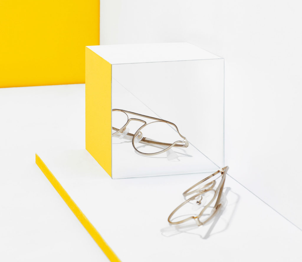
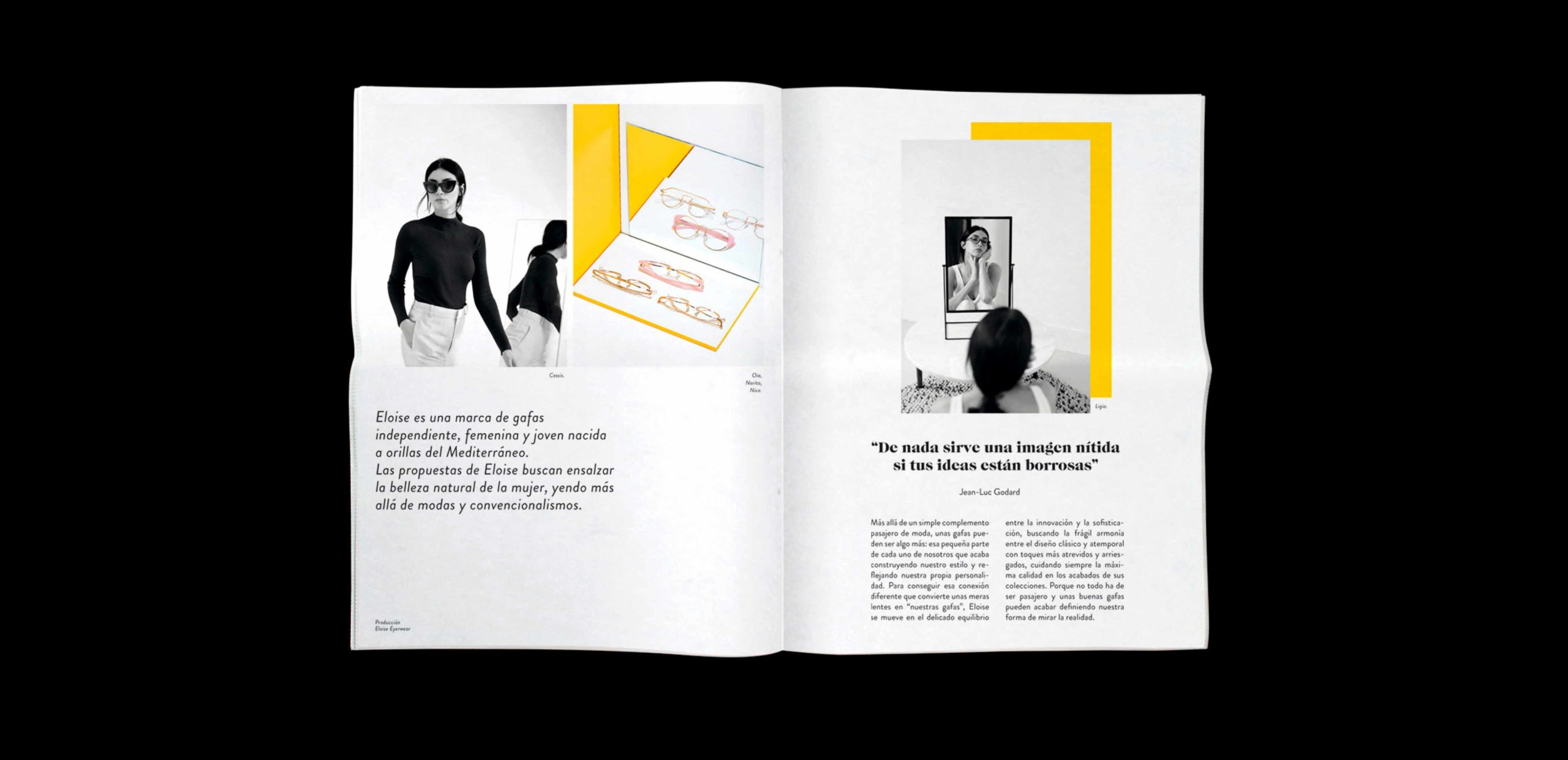
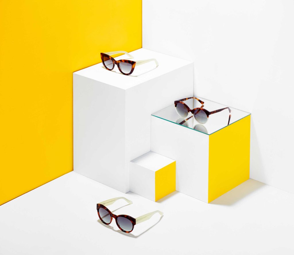
The Still Life photographs of the product were done in color to showcase the tones of the collection. However, the visual image of the campaign has centered around the use of the color yellow.
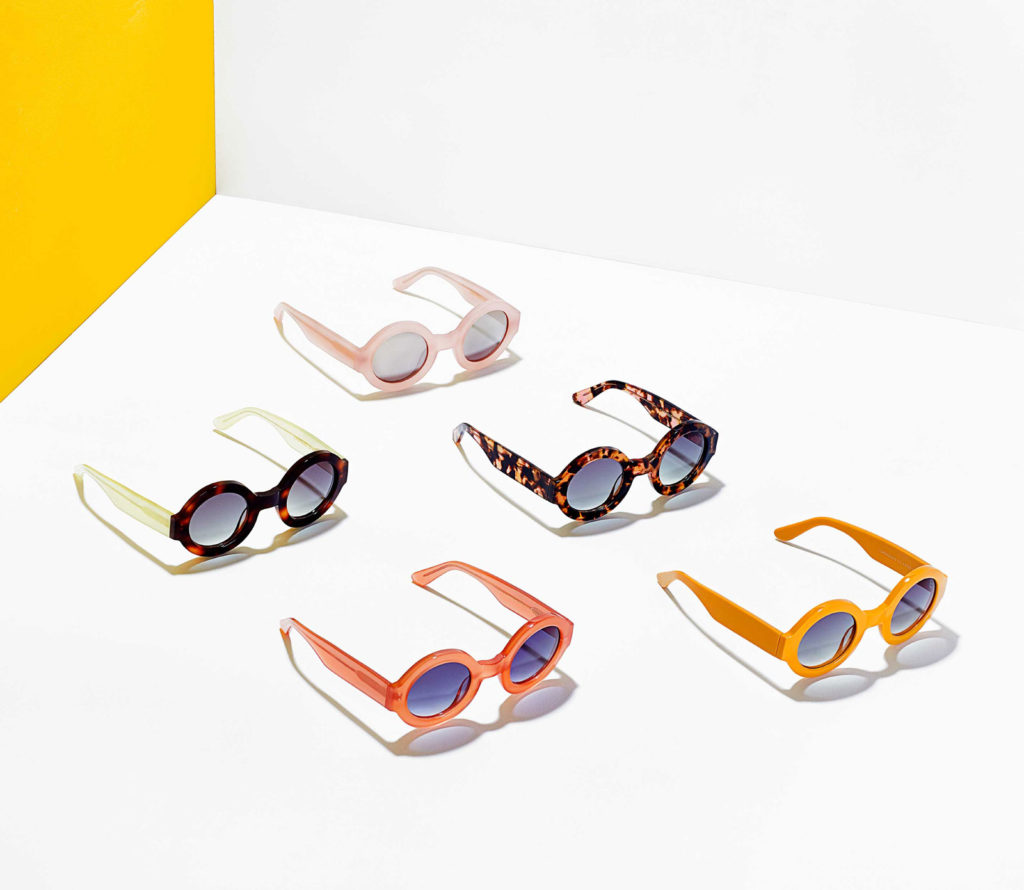
The Still Life photographs of the product were done in color to showcase the tones of the collection. The visual image of the campaign has centered around the use of the color yellow.
TheStill Lifephotographs of the product were done in color to showcase the tones of the collection. However, the visual image of the campaign has centered around the use of the color yellow.
Newspaper graphic design:
NURIA RICO
Newspaper graphic design:
NURIA RICO
At an editorial level, we wanted to distinguish the project from the usual catalogs that users could find in the opticians. We wanted a different type of visual, in a larger format (such as a newspaper), enabling us to communicate the values of the Eloise brand, namely innovation and freshness.
At an editorial level, we wanted to distinguish the project from the usual catalogs that users could find in the opticians. To do this we used a larger format (such as a newspaper), that enables us to communicate the values of the Eloise brand, namely innovation and freshness.
The stand at the Silmo optical fair was designed to respect the atmosphere surrounding it, resulting in an open space with furniture and mirrors that invited the public to view the collection.
Stand Graphic Design:
BEATRIZ BLANES
Stand graphic design:
BEATRIZ BLANES
The stand at the Silmo optical fair was designed to respect the atmosphere surrounding it, resulting in an open space with furniture and mirrors that invited the public to view the collection.
Stand graphic design:
BEATRIZ BLANES
The stand at the Silmo optical fair was designed to respect the atmosphere surrounding it, resulting in an open space with furniture and mirrors that invited the public to view the collection.

