Verso &
CUENTO
Client: PENGUIN RANDOM HOUSE
Author’s Book: ROGER WOLFE
Graphic Design & Illustration: AMAIA F. GOROSTIZA
Amaia F. Gorostiza – Art Direction and Design
Art Direction Portfolio of Amaia Fernández de Gorostiza

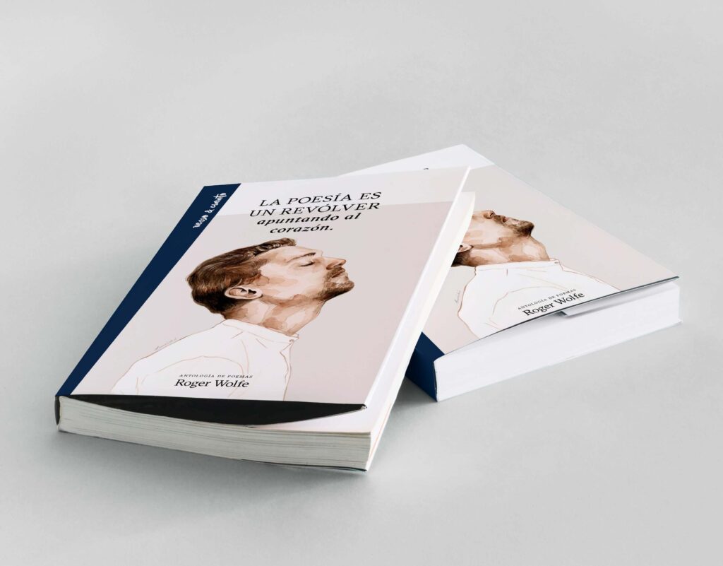

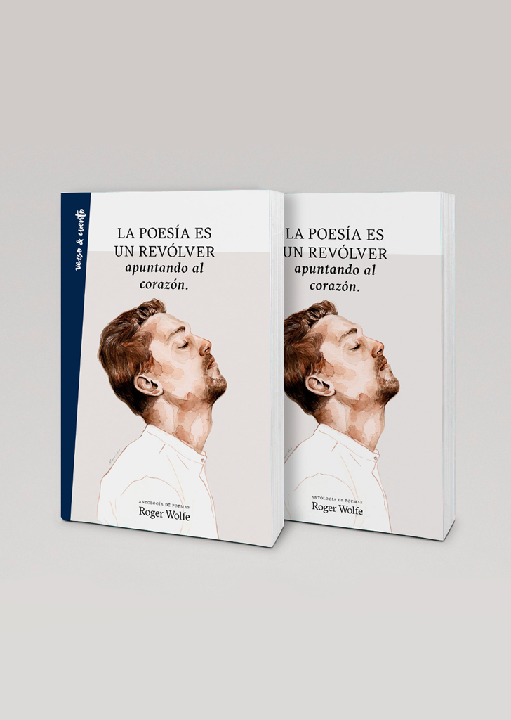
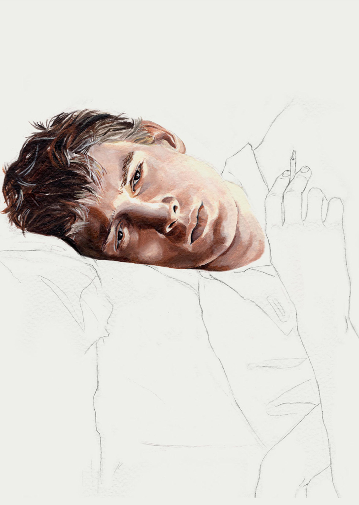
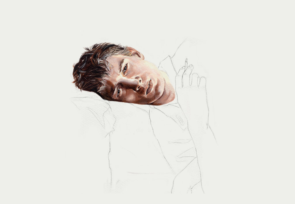
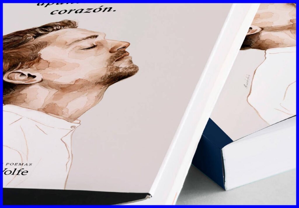
The final selected illustration attempted to represent two opposing concepts that are nevertheless related:
The Shot of Grace and the State of Grace, complementing the headline “Poetry is a revolver pointed at the heart”.
Space and color were used to go through the word “revolver”.
Spine color:
 C:83
C:83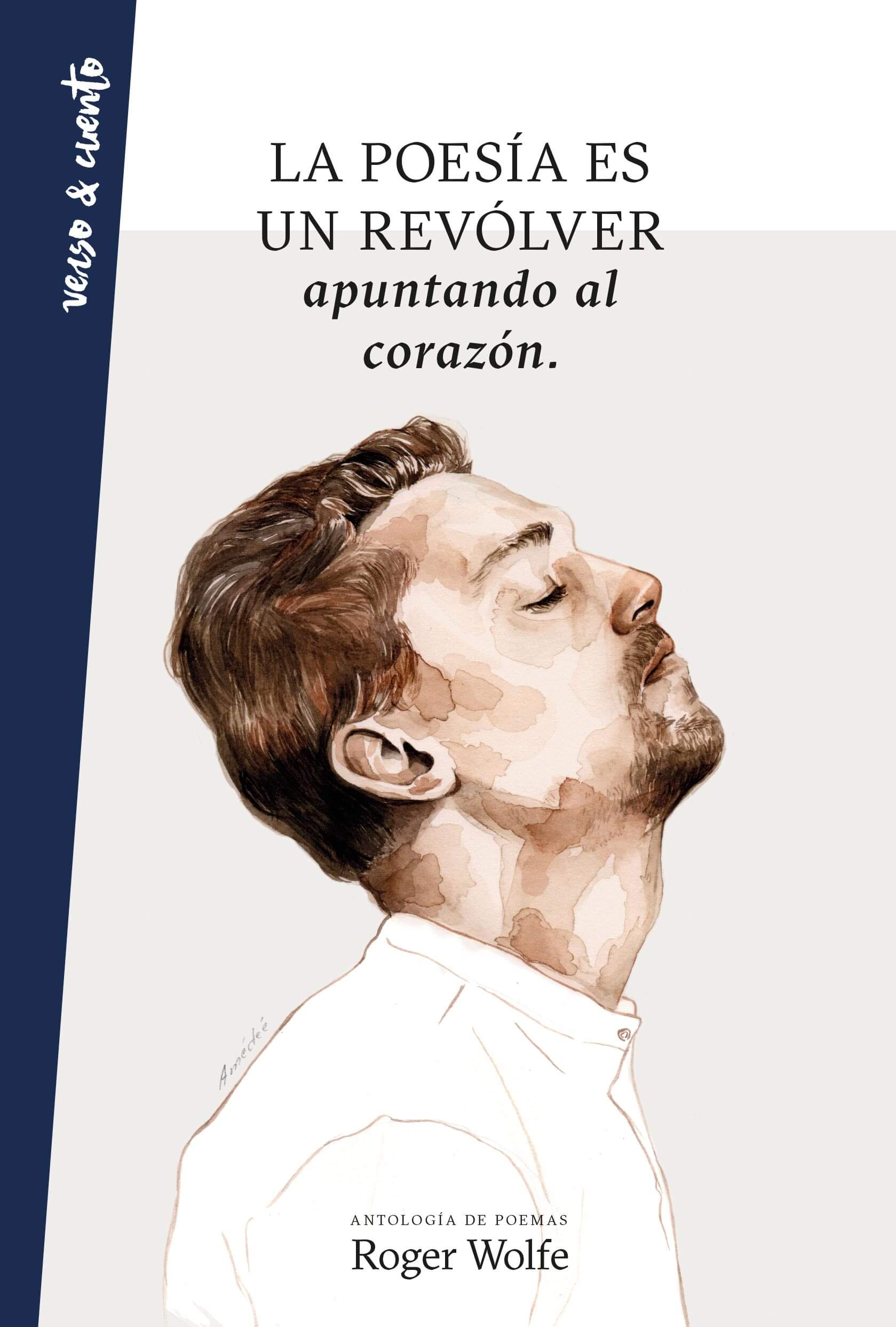
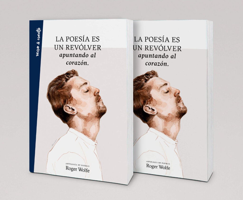
The final selected illustration attempted to represent two opposing concepts that are nevertheless related: The Shot of Grace and the State of Grace, complementing the headline “Poetry is a revolver pointed at the hear”.
Space and color were used to go through the word “revolver”.
Spine color:
C:83The final selected illustration attempted to represent two opposing concepts that are nevertheless related:
The Shot of Grace and the State of Grace, complementing the headline “Poetry is a revolver pointed at the heart”.
Space and color were used to go through the word “revolver”.
Spine color:
C:83